
Here’s something I keep running into. In my last three conversations with founders and product owners, every single one wanted to rush through the SaaS UX design process. Their reasoning was simple: “Design is slowing us down. Let’s just build.”
I get it. When you’re burning runway, every week feels expensive. However, skipping the SaaS UX design process rarely saves you time. Instead, it just moves the bill to later, and that bill is a lot bigger.
That’s not a one-off story, either. According to usability research compiled by the UXPA, a problem that’s cheap to fix in design costs about 10x more once it’s in development, and up to 100x more after release.
On the flip side, good design pays off. McKinsey’s Business Value of Design study tracked 300 public companies over five years and found that top design performers grew revenue 32 percentage points faster than their industry peers.
So, here are the 7 vital steps of the SaaS UX design process that I’d never let a client skip.
If I said user interviews are the bread and butter of the SaaS UX design process, I’d be 99.9% right.
This is where you uncover most of the insights that actually matter:
Even if you’ve already launched your MVP, always interview at least 3 to 5 real users of your product. If you’re new to it, Nielsen Norman Group has a great primer on user interviews.
We were redesigning the Provider RX portal, where U.S. doctors review patients’ RX requests and answer their questions based on a completed survey form.
During a one-hour call with real providers, we noticed something interesting. The doctors were used to seeing lots of data on a single screen. In fact, they skipped most of the text and only read what was highlighted in red. As a result, it took them just 5 to 10 seconds to review an entire RX request and decide on the medication.
That’s not unusual, by the way. In NN/g’s classic study on how people read online, 79% of users scanned pages, while only 16% read word by word.
So we reorganized and redesigned the data tabs around what mattered most. This helped doctors skim and scan instead of reading through full patient profiles.
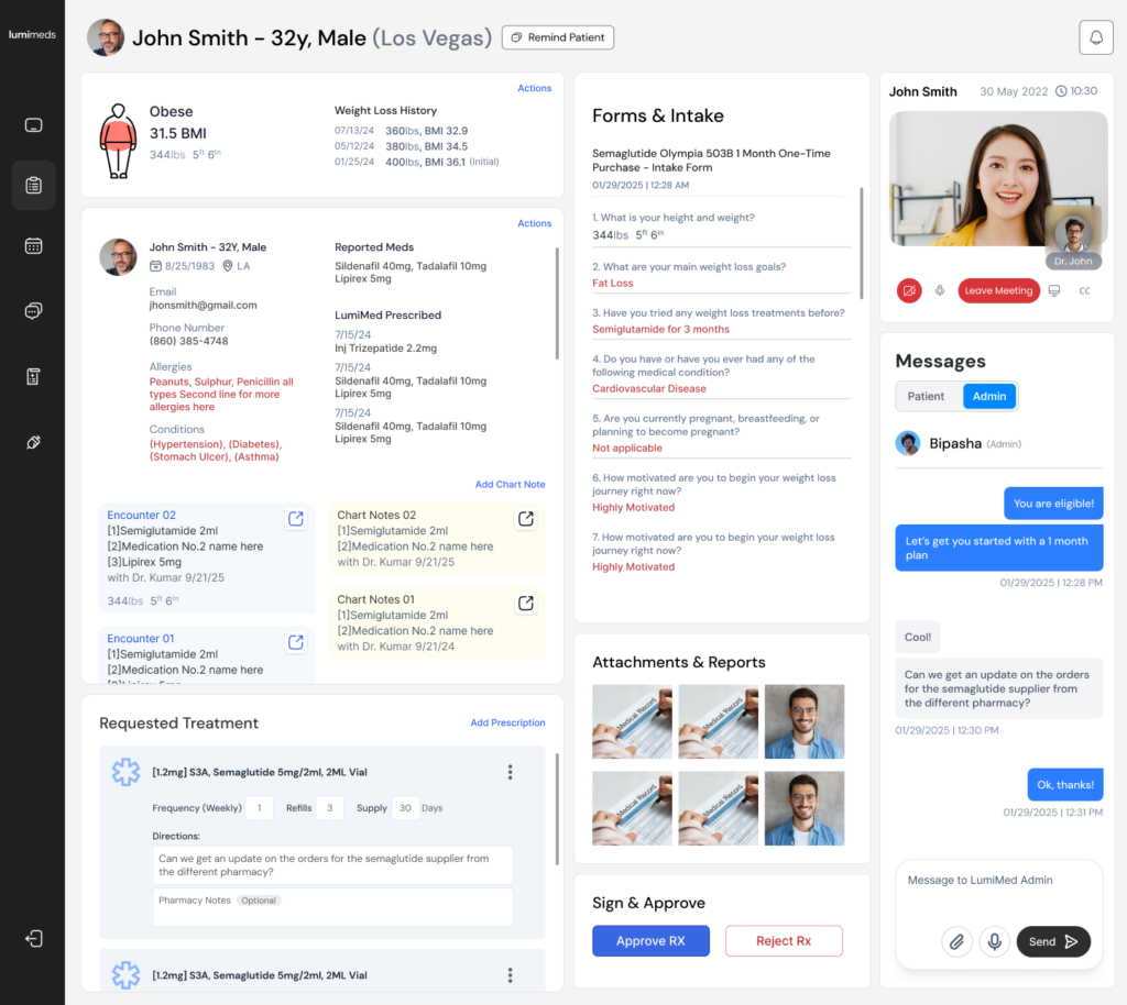
[Image: Provider(Doctor) RX portal redesign]
Without competitive analysis, it’s very hard to win. If another business is doing great, study what they’re doing well. Then, make your product clearly better in one or two areas your users care about.
This matters because your users are comparing you all the time. In fact, Zendesk’s customer experience research found that 79% of consumers would switch to another company if they found a better customer experience there.
When we were designing the customer portal for LumiMeds, the founder signed up for 3 to 4 of the most popular healthcare patient portals. Then, he sent us screen recordings of each UI and its user flows.
As a result, we studied four proven portals side by side and designed the best version for LumiMeds patients.
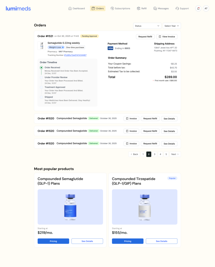
[Image: LumiMeds Customer Portal UX Redesign]
Happy paths are the user flows you and your customers dream about. Think of signing up, or buying a package for the very first time, with zero friction.
If you skip testing these flows, your users might hit a dead end or an error they can’t recover from. And honestly, most of them won’t stick around to figure it out. For example, Baymard Institute’s checkout research shows that 18% of U.S. online shoppers abandoned an order in a single quarter just because checkout was too long or complicated.
LumiMeds hired us to optimize their happy path: landing on the main page from a Facebook ad, then making a first purchase.
We focused mostly on the checkout flow, and here’s what we found:
The worst one? Users filled out a long survey with 10+ questions, and then got stopped by a message telling them to log in to the portal. There were no instructions on what to do next.
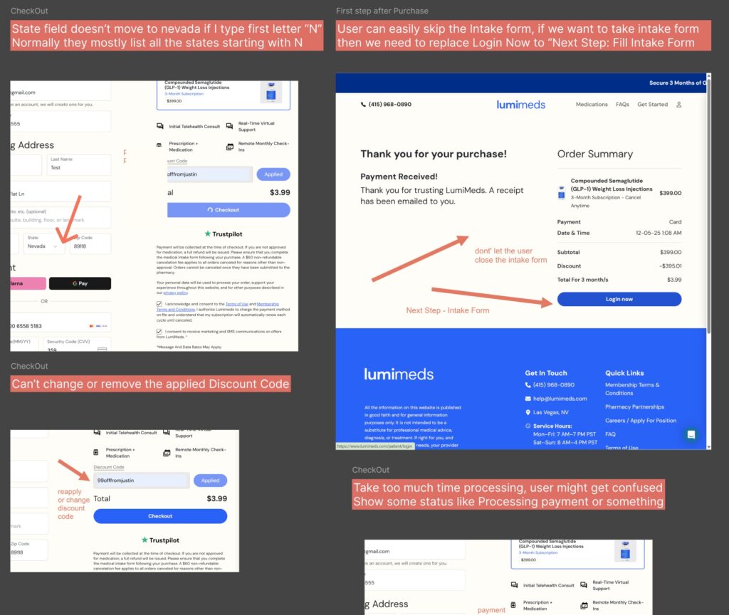
[Image: LumiMeds happy path user flow issues]
Once you’ve redesigned or optimized your product, it’s tempting to assume everything works perfectly. However, the moment you test it live with a real user on a Google Meet call, most products stumble somewhere.
The good news is that you don’t need a huge study. According to Jakob Nielsen’s research at NN/g, testing with just 5 users uncovers about 85% of usability problems.
That’s why it’s worth bringing in a UX expert to run thorough usability and accessibility testing across multiple user flows. A solid round of testing usually covers:
Your support team answers most of your customers’ problems and questions every single day. So, get them on the same page as your product team, and always invite them to product review meetings.
Here’s why that matters. According to Zendesk, 56% of consumers rarely complain about a bad experience. Instead, they quietly switch to a competitor. Your support team hears from the few who do speak up, so listen closely.
A few easy ways to collect more customer feedback:
One of the biggest problems with developer-led teams is vague copy. Buttons labeled “Submit” or “Go” rarely match what users expect to happen next.
This ties directly to Jakob Nielsen’s second usability heuristic: match between the system and the real world. In other words, your interface should speak your users’ language, not your database’s. NN/g also has a helpful explainer on how mental models shape what users expect from your product.
During our user research for Smodin, an AI writing app, we found that users believed the AI Checker would detect AI text with 100% accuracy and never fail. That was a classic mismatch between the user’s mental model and the system model.
So we changed the button labels and the UI. Now, when someone pastes text and runs a check, the result shows something like “POSSIBLE AI 60%”. Consequently, users get honest expectations right away.
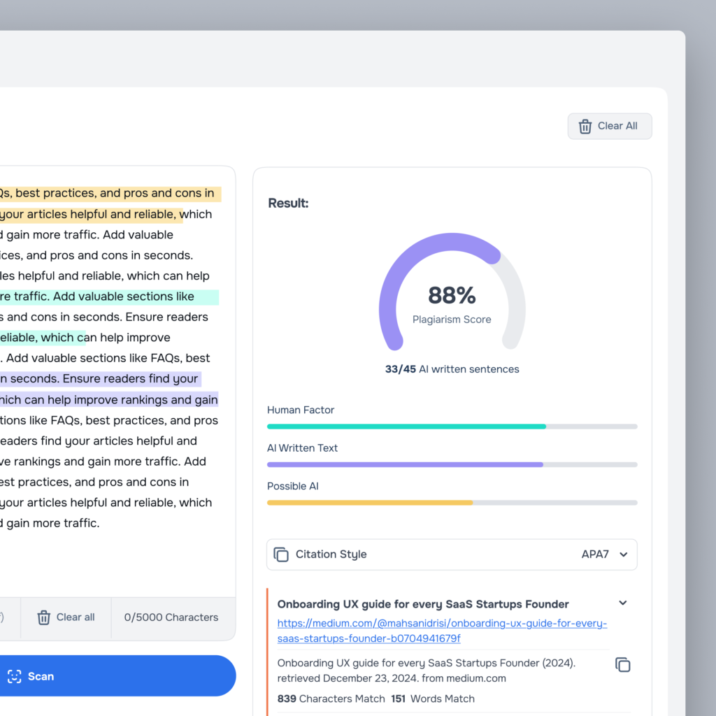
[Image: Smodin AI Checker after Redesign]
If you already have a published MVP or a working product, your very first step should be a UX/UI audit. It reveals usability, accessibility, UX and conversion issues that are hiding in plain sight.
The payoff can be big, too. Baymard’s large-scale usability testing found that the average large e-commerce site could lift its conversion rate by 35% through checkout design improvements alone. Meanwhile, SaaS sign-up and upgrade flows suffer from exactly the same kind of friction.
Not sure where to begin? Our SaaS UX audit checklist walks you through 40 things to check before a redesign.
Skipping UX doesn’t make you faster. It just makes every fix more expensive later. Here’s a quick recap:
At ProDesign, every SaaS UX design project we take on follows these steps, because they’re what turn a working product into one people love using.
Every week you wait, a hidden UX issue is quietly costing you customers. Let’s find it before your users do.
👉 Get a UX Audit for your SaaS product OR book a FREE 15-minute discovery call with our team.
We focus on fewer projects to craft amazing digital products