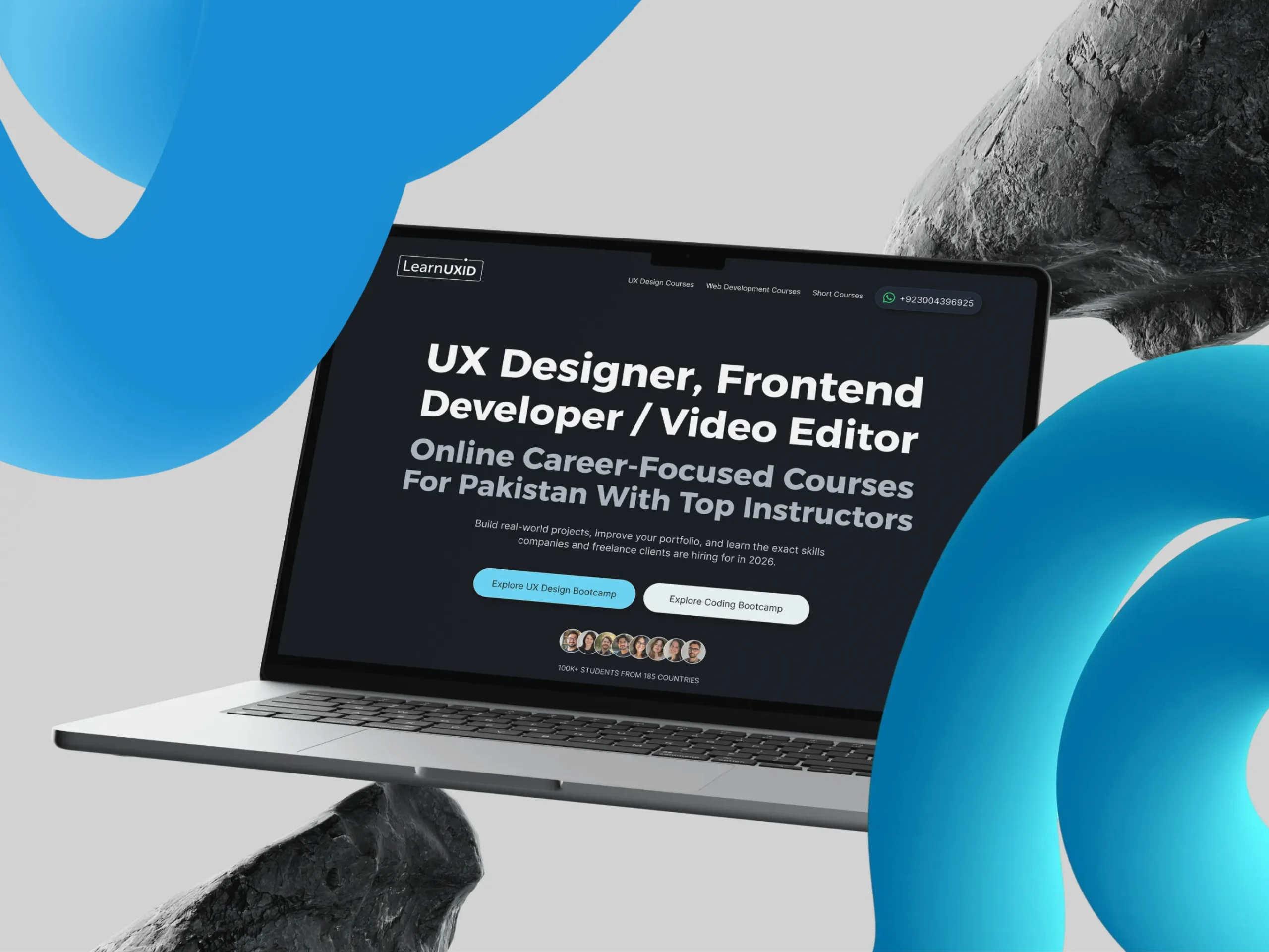
Client Needs & Business Goals
Designing a high converting landing page design & development solution for LearnUXID was driven by one clear mission; to strengthen their online presence and make their educational platform impossible to scroll past. The primary goal was to boost search visibility for high-intent keywords like landing page design & development, UX design course, UI/UX training, Video Editing, and Figma course, ensuring LearnUXID ranks where their future students are already searching.
Beyond visibility, the project demanded a fully responsive and scalable landing page built to attract students actively seeking online UX courses, design career guidance, and real-world freelancing skills. Therefore, every design decision was intentional from layout structure to content hierarchy crafted to improve user engagement, establish instant trust, and drive course enrollment conversions through a clear, persuasive, and student first user experience.
Client’s Website ► https://learnuxid.com/
About the Client
LearnUXID
Budget
$1500-$2500
Key Challenges in Landing Page Design & Development
- First and foremost, we built a high-converting landing page design & development solution for LearnUXID. Our main goal was simple stop visitors from leaving and turn them into enrolled students.
- Next, we broke down all course details into clear, easy-to-read sections. As a result, users can now scan the page quickly and find exactly what they need without confusion.
- After that, we wrote bold and direct calls-to-action across the page. This helped us boost lead generation and drive more sign-ups for the UX/UI design course.
- We then created targeted content for beginners, freelancers, and aspiring designers. Because of this, every visitor feels like the online UX course speaks directly to them.
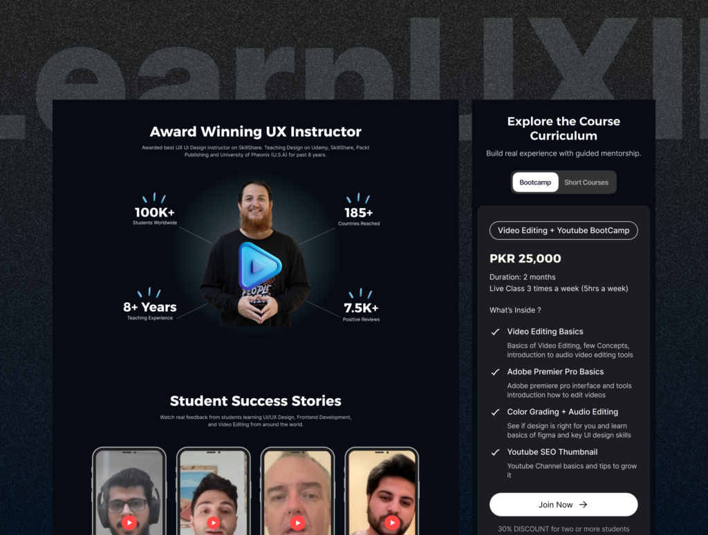
- To build confidence, we added real student testimonials, instructor profiles, and portfolio examples. Therefore, users trust the UI/UX training platform before they even scroll to the bottom.
- Furthermore, we designed the entire page to work smoothly on desktop, tablet, and mobile. So no matter where students browse, they always get a great experience.
- In addition, we structured the page around powerful keywords like UX design course, Figma course, UI/UX training, and freelancing course Pakistan. This directly improves search rankings and brings in more organic traffic.
- Finally, we built the page with clean navigation and a strong visual layout. We also made it fully scalable across WordPress, HTML, and Tailwind CSS — ready to grow with LearnUXID’s future.
Need Landing Page Design Service
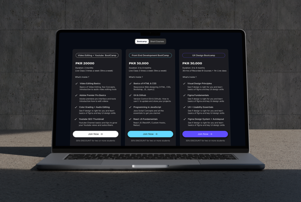
Figma Design & Landing Page Development for LearnUXID
After finalizing the project brief, we immediately jumped into Figma to begin the full landing page design & development process for LearnUXID. First, we established a clear design structure — defining layouts, typography, color systems, and component styles before touching a single screen. This gave us a solid foundation to build on consistently and efficiently.
Next, we used Figma AI to accelerate key design decisions and explore layout variations much faster than traditional methods. As a result, we saved significant time during the design phase and maintained a higher standard of quality throughout every iteration. Every section of the landing page was carefully crafted to support course enrollments, build trust, and guide users toward action.
Key Highlights:
- Design System & Component Setup: First, we built a complete design system inside Figma with reusable components, color variables, and text styles. This ensured every section of the landing page stayed visually consistent and easy to scale.
- Figma AI for Faster Design Decisions: Next, we used Figma AI to speed up layout exploration and refinement. As a result, we made smarter design choices faster and delivered a more polished final product.
- Screen-by-Screen Landing Page Design: We then designed every section of the landing page from hero to footer with clear visual hierarchy and conversion-focused layouts. Each screen was built with the end user’s journey in mind.
- Pixel-Perfect Developer Hand-off: Furthermore, we prepared clean, well-organized Figma files ready for development hand-off. This eliminated confusion for the dev team and kept the final build true to the original design.
- Responsive Design Across All Devices: Finally, we designed fully responsive layouts for desktop, tablet, and mobile inside Figma. As a result, the development team had a clear and approved reference for every break point before building began.
The End Result
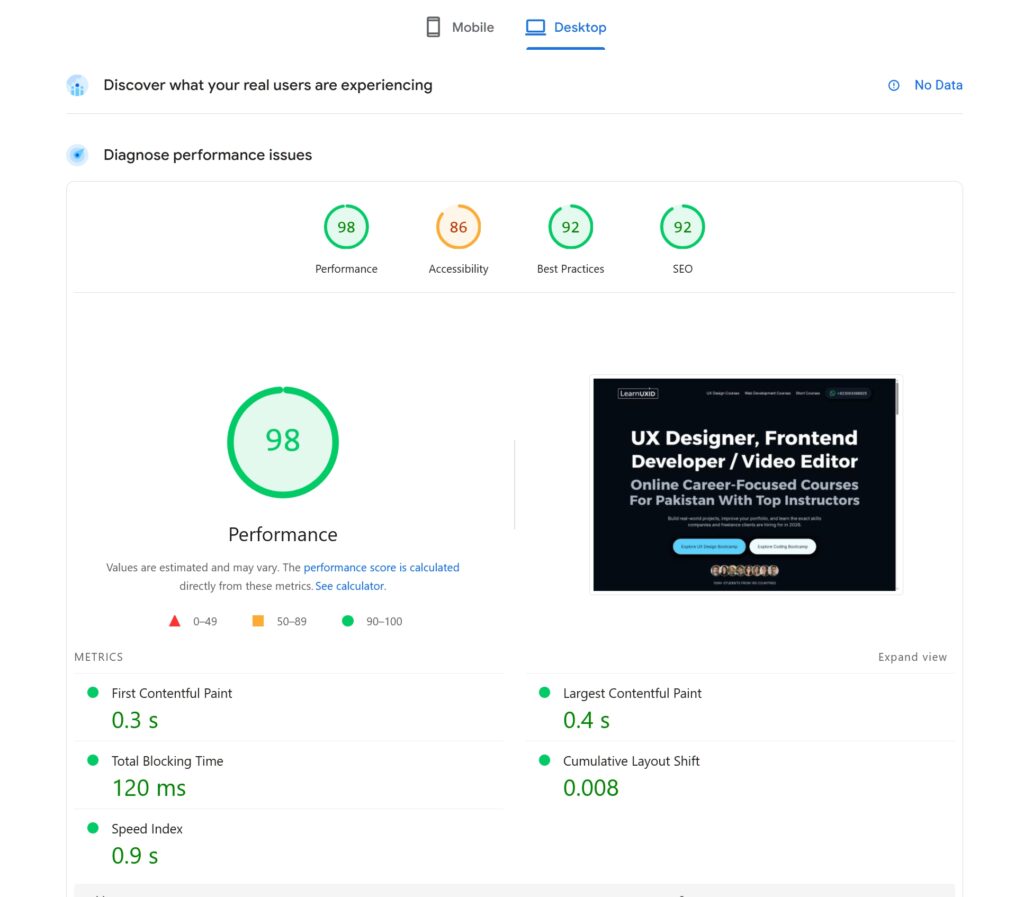
After completing the landing page design & development for LearnUXID, the results spoke for themselves. We delivered a modern, high-converting educational landing page that offers a smooth, engaging, and student-first experience from the very first scroll. Most impressively, after running a full performance test, the website scored an outstanding 98 out of 100 for page speed — placing it among the fastest educational landing pages available today.
- First, visitors immediately understand what LearnUXID offers. Clear messaging and conversion focused content remove all confusion and guide users straight toward enrollment.
- Next, the easy-to-scan layout helps users explore UX/UI courses, Figma training, and freelancing paths without effort. As a result, they make enrollment decisions much faster.
- Moreover, strategically placed testimonials, instructor credibility, and portfolio proof give visitors the confidence to take action without hesitation.
- Furthermore, the fully responsive design works beautifully across desktop, tablet, and mobile. Therefore, every student enjoys a consistent and friction-free experience no matter what device they use.
- Finally, and most notably, the website achieved a 98 out of 100 page speed score after testing. This means fast load times, better SEO rankings, lower bounce rates, and a smoother overall experience for every visitor.
Live URL ► https://learnuxid.com/
Client Feedback
Muhammad Ahsan – LEARNUXID Founder
“Pro Design team nailed the landing page design & development. They completely transformed how we present our courses online. Before the redesign, our website had no soul or a proper dark theme with low confidence and conversion. Now, we have a modern, high-converting educational platform with clear messaging, stronger trust signals, and a much smoother user journey. Our students and their queries are directly sent to WhatsApp and that is perfect to build a community.”