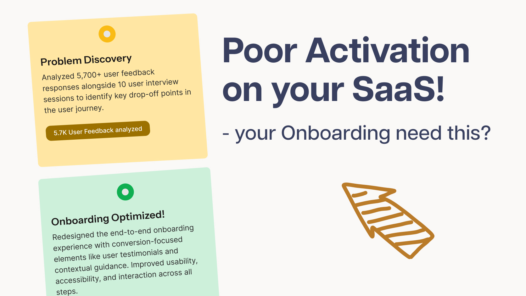
So you built your SaaS MVP, gave it away free to your first 1,000 users… and then watched most of them sign up and disappear. These 7 onboarding UX fixes will help you keep more of them, and an expert UX audit can catch what is left.
If that stings a little, you’re not alone — and it’s probably not your product that’s the problem. It’s usually the ten minutes right after signup, before anyone’s had a chance to fall in love with what you built.
I’ve spent a lot of time digging through onboarding flows — more than 30+ startups launching on AppSumo and Product Hunt, to be exact — and the same handful of mistakes keep showing up, over and over, regardless of the product. Here’s what’s actually going wrong, and how to fix it.
1. Signup Flow Friction: The Silent Killer of Your Onboarding UX
Here’s an uncomfortable stat: in about 30% of the products I tested, I personally couldn’t get through the signup form. Weird name restrictions, confusing validation, fields that felt more like an interrogation than a welcome mat.
Turns out that’s not just me being fussy — nearly 74% of users abandon apps with confusing or demanding sign-up flows, and a full 75% of SaaS users abandon a product within the first week. Your signup form isn’t a formality. It’s the first — and biggest — leak in your funnel.
A few things that genuinely move the needle:
Add Google/social login (SSO). It’s not optional anymore. Products with social login see up to 20% higher signup completion — people just want to skip the typing and get to the dashboard.
Cut your form fields. HubSpot trimmed their form from 11 fields to 4 and saw conversions jump 120%. Even Baymard’s research backs this up — every unnecessary field quietly costs you 3–5% of completions.
Don’t be weird about names. If your validation rejects real human names, that’s not a security feature, that’s a bug wearing a costume.
Think about edge-cases. Try to enter long and very short data in your text fields for your signup form
If your onboarding fires off more than 5 questions before someone reaches their dashboard, you’re making people do homework before you’ve shown them anything worth the effort. 72% of users abandon apps during onboarding when it demands too many steps — and every extra question adds a little more friction to an already fragile moment.
The mechanism is simple: it’s just cognitive load. Every question before value feels like a toll booth, and most people won’t pay it if they don’t have to.
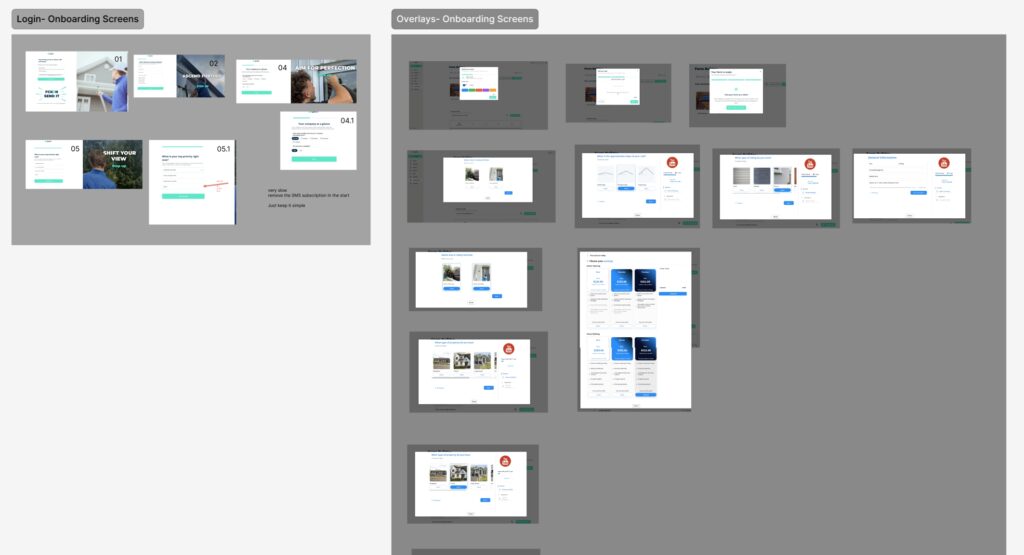
Real example: one of our clients Quoti.ai built a quotation tool for HVAC and window-cleaning contractors, and their onboarding was a 30-question survey — before users even saw the dashboard. We cut it down to 5 questions and got contractors into the product immediately. Activation jumped almost overnight. Ask what you truly need up front, and save the rest for later, once someone’s already seen your product do something useful.
Quoti.ai quotation builder more than 15 step Onboarding for new users
3. Time-to-Value: Show the “Aha Moment” Before You Charge Anything
Give people a real taste of your product. Don’t make your best features feel like a locked room they can only peek into.
Here’s where I want to push back gently on the usual advice, though — “just give them 14 days” or “just give them 30” isn’t really the lever people think it is. A large randomized study actually found that trial length barely moves the needle on conversion at all. What matters is whether someone experiences real value during that window — not how long the countdown clock runs. So instead of debating 14 vs. 30 days, spend that energy shortening the path to the moment your product actually clicks for someone — what most Product Development teams call the “aha moment.”
4. Upsell UX: Don’t Let Upgrade Pop Ups Sabotage Trust
Nothing kills goodwill faster than a product that’s begging you to pay before you’ve even figured out what it does. If every screen is shouting “upgrade now,” you’re not building urgency — you’re building annoyance.
We saw this firsthand with one of our redesign clients, Smodin.ai — their onboarding was hammering users with upgrade prompts at nearly every step, even during someone’s very first free session. The fix wasn’t to stop monetizing — it was to move those prompts to moments that actually made sense, like when someone hit a real usage limit, instead of interrupting every click. Let the product earn some trust first.
5. Lifecycle Email UX: Your First Touch points Are Part of the Product Experience
People pay unusually close attention to what lands in their inbox right after signup — onboarding email sequences can pull open rates as high as 83%, roughly 3x higher engagement than your typical marketing email. That’s a lot of attention to waste on a feature list.
Show, don’t tell. Instead of “here’s what our tool does,” try something like: “John expanded his business into the UK last month using our Quotation Builder — he’s now sending 9 quotes with a single click.” People remember outcomes, not specs.
Two small things that pay off disproportionately:
Lead with a hook, back it with proof. A short customer story paired with the feature behind it beats a features list every time.
Personalize it. Personalized subject lines get opened 26% more often, and personalization gives click-through rates a real lift too.
6. User Interviews: The Fastest UX Research Loop for Early-Stage SaaS
Honestly, this is the cheapest, highest-leverage thing a founder can do. Interview at least 3 paying customers and 2 people who almost bought but didn’t. If three of them independently mention the same annoying thing, congratulations — you’ve found your next fix without guessing.
This isn’t just a hunch, either — it’s backed by decades of usability research: talking to just 5 people from your target audience tends to surface around 85% of the real usability problems in a product. You don’t need a 500-person survey. You need five honest, slightly annoyed conversations.
Let 3-5 User tests your Onboarding UX
If I say that there is one must have for every product UX testing, then you can’t skip this step in any case. If you can’t test 3 to 5 users for your Onboarding User flow, you are going to regret it after 6 months.
7. Heuristic Evaluation & UX Audits: Get an Expert Review Before You Scale
Most founders are either developers or marketers — brilliant at their thing, but rarely trained to spot usability problems, which is exactly why those problems hide in plain sight. You know your product too well to see it the way a confused new user does.
A proper heuristic evaluation, done by a few experienced UX people, typically catches around 75% of the usability issues hiding in a product — noticeably more than the “30–50%” figure often thrown around, and often enough to change your whole onboarding funnel. It’s one of the fastest ways to see your product the way your users actually do.
One of our clients, Allen Tang, put it more bluntly than I would: “Most of your customers are dumb — design the client portal keeping that in mind.” Harsh phrasing, fair point — design for your least patient user, not your most technical one.
Ready to see what’s quietly leaking in your onboarding?
Usually the first ten minutes after signup rather than the product itself: signup friction, too many questions before value, a slow path to the first moment of value, upgrade pop-ups that arrive too early and weak first emails.
How many questions should onboarding ask before the dashboard?
Aim for no more than about five. One of our clients, Quoti.ai, cut a 30-question survey down to 5 questions and got users into the product immediately. Ask what you truly need up front and save the rest for later.
Does a longer free trial improve conversion?
Not by much, according to a large randomized study cited in this post. What matters is whether the user experiences real value during the trial, so shorten the path to the moment your product clicks rather than debating 14 versus 30 days.
When should upgrade prompts appear?
At moments that make sense, such as when a user hits a real usage limit, not on every click. For Smodin, we moved upgrade prompts away from the first free session so the product could earn trust first.
How many users should I test my onboarding with?
Test your onboarding flow with 3 to 5 users. The post also recommends interviewing at least 3 paying customers and 2 people who almost bought but did not. Talking to about 5 people from your target audience tends to surface around 85% of real usability problems, according to long-standing usability research.