Onboarding is your product’s first “hello” to a new customer. It should feel inviting, effortless, and light on friction, not like a chore your user has to survive. Over the years of auditing SaaS Startups, we’ve noticed the same onboarding UX mistakes showing up again and again, quietly draining activation and revenue before founders even notice. Let’s walk through them.
Most sign-up flows use a simple form or a “Sign up with Google” option, and that’s exactly where things go wrong. Form usability is one of the most commonly overlooked parts of onboarding UX, and the numbers back this up. The average U.S. checkout or sign-up flow displays close to double the number of form elements that’s considered optimal, and around one in five users abandon a flow purely because it feels too long or complicated. shno
So, before you ship your next form, test it with a real, non-technical user while you watch silently. Look out for:
Confusing validation errors (“username can’t be too long” type messages)
Input limits that reject valid names or emails
Edge cases like very short or very long names
Unclear password or field requirements
A messy form is often the very first UX impression your SaaS Startup makes, and first impressions are hard to undo.
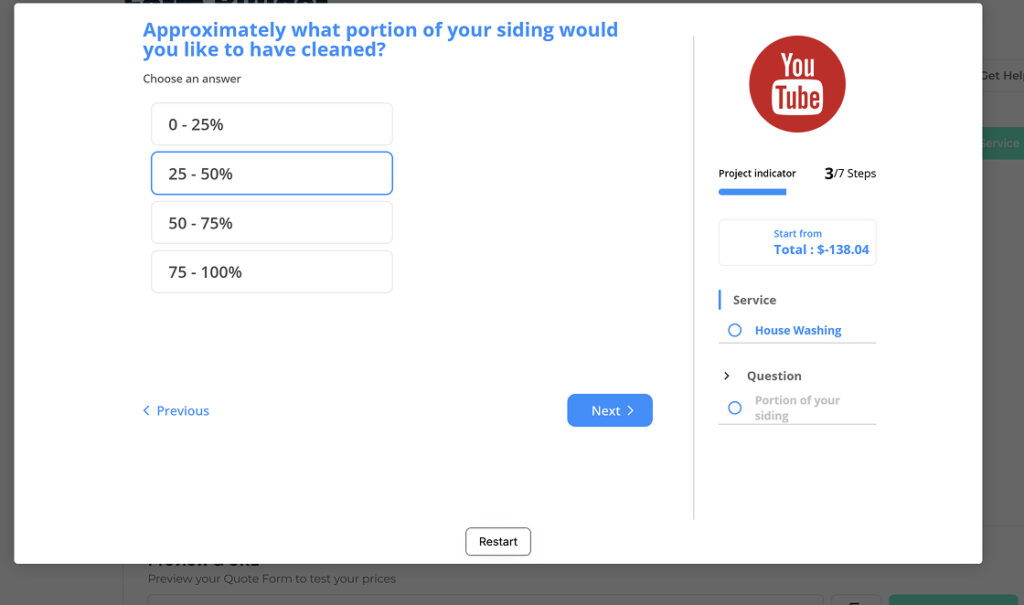
PROBLEM – A 20+ question onboarding process that was reduced to 5 to 6 questions for first time users
One of the steps with dislocated information on the right
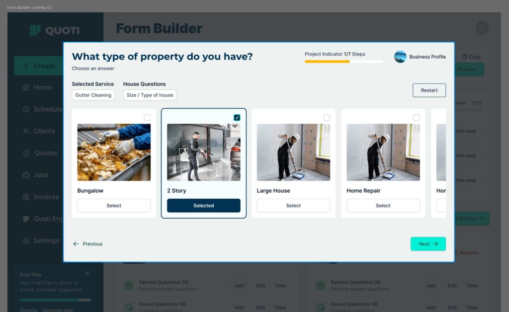
FIX – Reduced to just 4 questions and 3 more steps to setup profile quickly and show the dashboard
Streamlined and simple 7 step Onboarding Redesign for Quoti Builder
2. Don’t Build Sign-Up Walls or Long Surveys
When you meet someone for the first time, you ask their name, not their income and 30 other details. Yet plenty of Startups we’ve worked with had onboarding setups stretched across 20-30 screens before a user could even see the product. Unsurprisingly, founders came to us complaining about low activation.
The pattern is well documented: every extra onboarding step costs you another 10-20% of your users, and the industry-wide picture isn’t encouraging either. Roughly 80% of new users drop off within the first three days, and average B2B SaaS activation sits around just 37.5%. In other words, the longer you make them wait to feel value, the more of them walk away. devchameleon
Keep the sign-up short. Let users experience the product first, and collect the rest of the profile data later once they’ve had a taste of what you offer.
3. Don’t Push Premium Plans on First-Time Users
Imagine meeting a salesperson who asks you to buy a car the moment you say “hi.” That’s exactly how aggressive upgrade pop-ups feel to a brand-new SaaS user. If you want first-time visitors to eventually convert to paying customers, don’t interrupt them with an “Upgrade Now” pop-up every five minutes.
Instead, give them a genuine 7 or 14-day free trial and let them enjoy the full ride. Once a user experiences real value, converting them into a loyal customer becomes far easier and cheaper than chasing them with constant paywalls.
4. Make Your Support Fast, Visible, and Responsive
Do you have a support button, and more importantly, a teammate actually watching it? Users are naturally impatient, and this shows up clearly in support data: customers who get a response within an hour are 40% more likely to rate the overall experience positively, and speed of response now ranks above resolution quality as the top factor customers care about. stealthagents
That help button is also a feedback engine. Here’s how to make the most of it:
Collect and tag every issue by urgency and impact
Feed the important ones into your product backlog
Tell users when a fix is coming (Figma is a great example of communicating upcoming releases clearly)
Follow up once it ships
A single slow, silent support experience can cost you a rating and a customer you’ll never get back.
5. Audit Your User Flow for Dead Ends
While performing a detailed UX audit for smodin.io, an academic writing AI tool, we found several blocked user flows where users had no clear next step and were literally copy-pasting text between windows to get their job done.
Fixing dead ends (points where a user gets stuck with no clear next action) typically drives a 15% to 40% increase in user satisfaction scores such as CSAT or SUS. Every user flow should end with the user reaching her goal, not stuck mid-way. So, we mapped the user goals from real feedback, matched them to the existing flows, and connected each dead end to the next logical step the user actually wanted to take.
6. Localize Pricing for Global Customers
In many economies across Africa and Asia, a flat $15-a-month subscription simply isn’t realistic. If your SaaS Startup is selling globally, you need to think seriously about location or currency-based pricing.
Implementing localized pricing can increase overall SaaS sales and revenue by an average of 20% to 70% (source: Stripo SaaS pricing research). That’s a significant amount of revenue left on the table simply because pricing wasn’t adapted to where your customers actually live.
7. Get a Thorough Onboarding UX Review From an Expert
As we always say, two minds see more than one. A fresh set of eyes, especially one trained specifically in onboarding UX, can usually spot the friction points founders have simply gotten used to. A proper UX Review can hand you fixable insights within days, packaged in a simple, actionable report.
What a Good UX Review Covers
Form and sign-up usability
Onboarding flow length and drop-off points
Free trial vs. premium pacing
Support visibility and response gaps
Dead ends across core user flows
Pricing and localization opportunities
Ready to see where your SaaS product is losing users?
What are the most common onboarding UX mistakes in SaaS?
The ones we see most often are hard-to-use sign-up forms, long sign-up walls and surveys, pushing premium plans on first-time users, slow or hard-to-find support, dead ends in user flows and flat pricing for a global audience. A UX review covers each of these.
How many questions should a SaaS sign-up ask?
Keep it short. Let users experience the product first and collect the rest of the profile data later. In our Quoti redesign, a 20+ question onboarding process was cut down to just four questions plus a few setup steps before the user saw the dashboard.
Should I show upgrade prompts to first-time users?
Avoid interrupting them. Offer a genuine 7 or 14-day free trial and let users reach real value first. Once they have, converting them is easier and cheaper than chasing them with constant paywalls.
What is a dead end in a user flow?
A dead end is a point where the user gets stuck with no clear next action. In our UX audit of Smodin we found blocked flows where users were copy-pasting text between windows; the fix was to map user goals and connect each dead end to the next logical step.
How quickly can an onboarding UX review show results?
A proper UX review can hand you fixable insights within days, packaged in a simple, actionable report. See our UX audit and what a SaaS UX audit costs.