When did you last run a SaaS UX audit on your product? Picture this. Your SaaS has a great launch day, but a few months later the bad reviews start coming in and you can’t tell why. Your marketing still works, yet churn keeps going up. Satisfaction is falling, and negative comments are showing up on Google Reviews and Product Hunt.
Before you pay for a full redesign, or launch on AppSumo or ProductHunt, a structured SaaS UX audit can show you what’s actually broken. In many cases it saves you from a redesign altogether.
Here’s the checklist our team at ProDesign.Tech uses on client products.
Why a SaaS UX Audit Comes Before Any Redesign
A redesign without an audit is a guess. According to Wyzowl’s onboarding research, 80% of people have deleted an app because they didn’t know how to use it. The problem usually isn’t how the product looks. It’s the friction users hit before they reach its value. An audit finds that friction first, so your redesign budget goes where it counts.
1. First Impressions: Audit Your SaaS Landing Page
Your hero section works like a first handshake. In fact, research by Lindgaard et al. found that users form a visual impression of a website in about 50 milliseconds. So check these first:
- 1.1 Headline clarity: Can a visitor tell what you do, and who it’s for, in one read?
- 1.2 Supporting copy: A short, two-line paragraph that backs up the headline.
- 1.3 Real product visuals: Show your actual product UI, paired with a real customer review.
- 1.4 A strong CTA: Verb-led, high contrast and above the fold (e.g., “Start free trial”).
- 1.5 Social proof: Put logos, ratings or testimonials above the fold or just below it.
- 1.6 No trial barriers: Let users try the premium experience (like a 7-day trial) without hoops.
- 1.7 Page speed: Google found that 53% of mobile visits are abandoned when a page takes longer than 3 seconds to load.
Need a stronger first impression? See our landing page design services.
2. Sign-Up & Onboarding: The Most Important SaaS UX Audit Step
In most of the SaaS UX audits we’ve run, the biggest issues showed up in sign-up and onboarding. That’s the first barrier between users and your dashboard, your features and the value you offer. On top of that, Baymard reports that 18% of users abandon when they’re forced to create an account.
- 2.1 Frictionless sign-up: Keep forms short so users can start using the product quickly.
- 2.2 Fewer questions: Ask 3 to 5 questions at most during onboarding. You can always ask the rest later.
- 2.3 Time to value: Does onboarding get users to your core feature fast?
- 2.4 Social login: Offer Google, Apple, Microsoft or LinkedIn sign-in, depending on your niche.
- 2.5 Progress feedback: Show users where they are in the process and let them move back and forth easily.
- 2.6 Helpful empty states: Replace blank screens with guidance, e.g., “Your client list is empty” plus a clear “Add your first client” button.
- 2.7 Onboarding checklist: A short checklist of 3 to 5 first actions nudges users toward activation.
For example, see how we reworked a healthcare flow in our LumiMeds onboarding UX redesign, or explore our onboarding UX services.
3. Navigation and Information Architecture in a SaaS UX Audit
Never hide your features behind navigation walls. I say this in almost every UX talk I give. That’s why information architecture carries so much weight in a SaaS UX audit.
- 3.1 Global navigation: Features and pricing are visible, logically grouped and free of jargon.
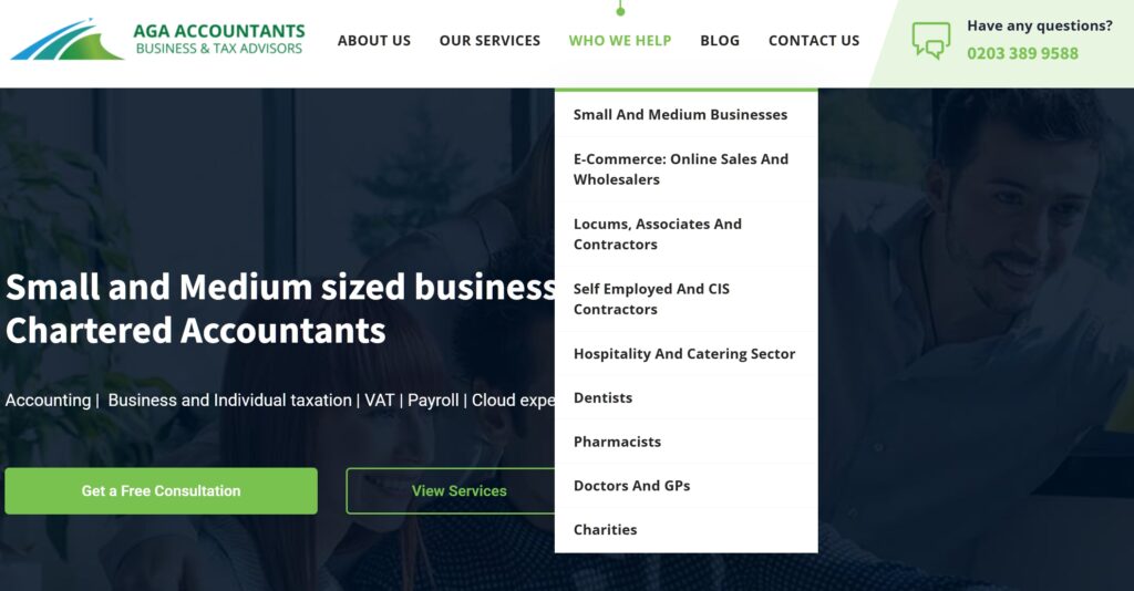
- 3.2 Navigation depth: Keep it to 5 or fewer sub-items per menu group. For instance, a new client of ours offers accounting services to medical and dental practices, but their main service was buried deep in the navigation.
- 3.3 Breadcrumbs and wayfinding: Structure content around your primary user’s goal. Can they find what they came for?
- 3.4 Search: In feature-rich products, in-app search is often the fastest route to a feature.
- 3.5 Consistent naming: Use the same label for a feature everywhere, including menus, buttons and help docs.
4. SaaS Dashboards and User Flows
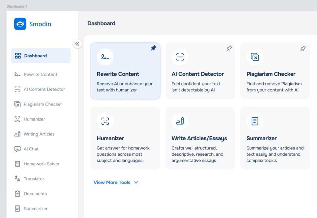
On paper, a user flow looks simple, almost like a short story. Once it’s designed and built, however, it can easily turn into ten steps. Your dashboard should present data in a simple, meaningful and customizable way for every user.
For example, in our SaaS redesign of the Smodin AI app, users can customize and pin dashboard features to fit their needs.
- 4.1 Visual hierarchy: After onboarding, are your primary features and paths clearly visible?
- 4.2 Data filtering: Can users quickly filter what they need? For LumiMeds, we added 15+ basic-to-advanced order and subscription filters so admin and support teams could get through daily tasks faster.
- 4.3 Responsive tables: Designs must adapt to every screen size. We typically rework about 20% of a design for mobile.
- 4.4 Clear flow paths: Don’t block users from finishing their goals. During Smodin’s UX research, our team found 11+ blocked user paths.
- 4.5 Actionable charts: Does each graph tell users what to do next, or does it just display numbers?
- 4.6 Color contrast: Check text against WCAG AA (4.5:1) or AAA (7:1). The WebAIM Million 2026 report found low-contrast text on 83.9% of home pages.
- 4.7 Accessibility: The CDC reports that more than 1 in 4 U.S. adults live with a disability. Test with tools like Lighthouse, axe DevTools or WAVE.
- 4.8 UI consistency audit: Screenshot and list every button, card, style and link variant. Duplicates and one-off styles are clear signs of design debt.
- 4.9 Avoid generic AI-made UI: Lately we see so many look-alike shadcn/ui apps on Mobbin that they blur together. Add your own brand flair, such as a distinct color or theme, so you stand out.
5. Forms, Inputs and Error Prevention
Forms are often neglected because founders and developers don’t give them much attention. For example, a phone or number field on mobile should open the number pad, not the full keyboard. Meanwhile, Baymard found that 31% of sites have no inline validation at all.
- 5.1 Inline validation: Validate each field when the user moves to the next one, not after they submit a long form.
- 5.2 Helpful error messages: Say what went wrong and how to fix it. Cryptic messages like “X05Z5559 data API error” only confuse people.
- 5.3 Smart defaults: Any pre-filled value or pre-checked option should be the best choice for the user.
- 5.4 Correct mobile keyboards: Use the right input types for email, phone and number fields.
- 5.5 Visible labels: Don’t use placeholders as labels, because they disappear the moment users start typing.
- 5.6 Save progress: Auto-save long forms so a refresh doesn’t wipe out a user’s work.
6. Usability Testing: Validate Your SaaS UX Audit With Real Users
Usability testing on your SaaS MVP gives you some of the most actionable fixes in a short time. According to Nielsen Norman Group, testing with just 5 users uncovers about 85% of usability problems. So recruit 3 to 5 real users who’d actually buy your product, then test these paths:
- 6.1 Edge cases: The most unusual or extreme ways someone might use your product.
- 6.2 Happy path: The ideal journey from landing page to checkout.
- 6.3 Checkout and billing: New purchases, upgrades, plan changes and cancellations. Baymard found that 17% of users abandon a checkout that’s too long or complicated.
- 6.4 Onboarding: First-time experiences for both free and premium users.
- 6.5 First dashboard visit: The route from sign-up or login to the dashboard. Is there one obvious next action?
- 6.6 Core feature flows: Watch users work with your core features. It’s often eye-opening for users and painful for founders to see, which is exactly why it’s worth doing.
How to Turn Your SaaS UX Audit Into a Redesign Roadmap
Once you’ve gone through the checklist, rank each issue by impact (how many users it affects) and effort (how hard it is to fix). Then fix the quick, high-impact items first, such as error messages, contrast and empty states. After that, move on to bigger changes like navigation or onboarding. As a result, a “full redesign” often turns into a focused set of fixes that pay off within weeks.
Get a Professional SaaS UX Audit
Your users are already telling you what’s wrong. A SaaS UX audit helps you hear it before they churn.
👉 Book a SaaS UX audit with ProDesign.Tech, or talk to our lead UX designer about a full SaaS UX redesign.