A founder once told me, “We don’t need SaaS UX design principles. We need more features.” Six months later, they had twice the features and the same churn rate.
I get it. Principles sound academic, while features feel like progress.
However, principles are what make features usable. Without them, every new screen adds a little more confusion.
So in this post, I’ll walk you through the seven principles I use on every SaaS project, with the research behind each one and real examples from our work.
Why SaaS UX Design Principles Matter More Than Trends
Design trends change every year. Glassmorphism comes and goes. Meanwhile, the principles behind good UX barely move, because human brains don’t get software updates.
And the payoff is real. In its Business Value of Design study, McKinsey found that top design performers grew revenue 32 percentage points faster than their industry peers over five years.
In other words, SaaS UX design principles aren’t decoration. They’re a growth strategy.
Quick Cheat Sheet: 7 SaaS UX Design Principles
Short on time? Here’s the whole list:
- Real users first: decisions come from research, not opinions
- Clarity: obvious beats clever
- Low cognitive load: show less, help more
- Consistency: same thing, same look, same behavior
- Feedback: every action gets a response
- Accessibility: design for every user
- Iteration: measure, learn, improve
Principle 1: Start With Real Users, Not Opinions
The loudest voice in the room is rarely your user. Yet McKinsey found that over 40% of companies still aren’t talking to their end users during development.
The fix is smaller than you think. According to NN/g, testing with just 5 users uncovers about 85% of usability problems. So one afternoon of testing can save months of building the wrong thing.
“You are not your Users“
Principle 2: Choose Clarity Over Cleverness
Clever icons and witty labels feel great in a design review. Unfortunately, they feel terrible to a busy user on a Monday morning.
NN/g’s research shows that 79% of users scan new pages, while only 16% read word by word. That’s why clear labels, plain headings and one obvious next step win every time.
Principle 3: Reduce Cognitive Load
Every option you show is one more decision your user has to make. Therefore, the best SaaS screens show only what’s needed for the task at hand.
And most options aren’t needed anyway. Pendo’s Feature Adoption Report found that 80% of features in the average software product are rarely or never used.
A few practical ways to lighten the load:
- Hide advanced settings behind a clear “More options” link
- Use smart defaults, so users don’t start from zero
- Let people recognize options instead of remembering them
- Break long setups into short, clear steps
- Icons with labels, rather than making it modern, design for dumb people
Principle 4: Stay Consistent Everywhere
Consistency is one of NN/g’s 10 usability heuristics, because users shouldn’t have to wonder whether different words or actions mean the same thing.
In SaaS, inconsistency sneaks in when different developers build different screens. As a result, you get three button styles and two ways to delete a record. A simple design system with shared components solves this, and it also speeds up development.
Principle 5: Give Instant, Honest Feedback
Users need to know that the system heard them. According to NN/g, 0.1 seconds feels instant, 1 second keeps the user’s flow of thought intact, and about 10 seconds is the limit for keeping attention.
So show loading states, confirm saved changes, and write error messages that explain how to fix the problem. “Something went wrong” is not feedback. It’s a shrug.
Principle 6: Design for Everyone (Inclusive Design)
According to the World Health Organization, about 1.3 billion people, or roughly 16% of the global population, experience significant disability. Many of them are your potential customers.
Still, most of the web isn’t ready. The WebAIM Million 2026 report found detectable WCAG failures on 95.9% of the top one million home pages. Good contrast, labeled inputs and keyboard support are a solid start, and they make your product easier for everyone else, too.
Principle 7: Measure, Learn and Iterate
Good UX is never “done.” Even so, McKinsey found that just over 50% of companies have no objective way to assess or set targets for their design teams’ output.
Pick a few metrics, such as activation rate, task completion and support tickets, and review them every month. Also, fix problems early. The UXPA notes that a problem costs about 10 times more to fix in development than in design, and up to 100 times more after release.
Real Stories: SaaS UX Design Principles in Action
LumiMeds: clarity and feedback in healthcare onboarding
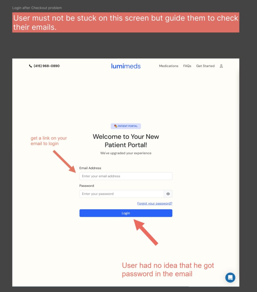
In the LumiMeds onboarding redesign, patients were uploading random images because the upload step wasn’t clear about what it needed. So we added icons and illustrations that show exactly which document to upload.
As a result of the wider onboarding redesign, new-customer conversion went up by 3%. That’s Principles 2 and 5 working together.
Knutsford Express: feedback that arrives at the right moment
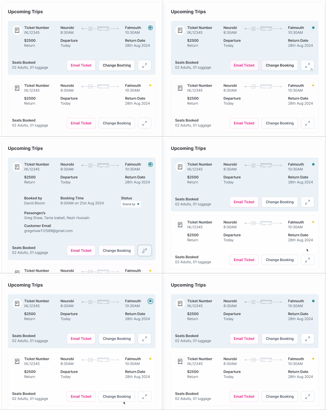
For the Knutsford Express travel dashboard, we put upcoming trips front and center. We also added a Upcoming Trips “pulse” for departures within 30 minutes, so travelers instantly know when to move.
See the Live Dashboard here (coded with Bootstrap) https://prodesign.tech/portfolio/knutsford/
In other words, the dashboard answers the user’s most urgent question before they even ask it.
How to Apply These SaaS UX Design Principles This Month
You don’t need a full redesign to start. Instead, try this four-week plan:
- Week 1: watch 5 users complete your most important task
- Week 2: rename confusing labels and remove one unused option per screen
- Week 3: add loading states, success messages and helpful errors
- Week 4: fix contrast and missing form labels, then measure again
Want a faster start? A UX audit checks your product against these principles in days, not months. Our Micro UX Audit starts at $1,499 and takes 3 days.
For a bigger picture, read our practical guide to SaaS UX design or our 7 SaaS UX design steps.
Turn SaaS UX Design Principles Into Growth
Here’s a quick recap:
- Talk to real users, even just 5 of them
- Be clear, not clever
- Show less and guide more
- Keep everything consistent
- Respond to every action
- Design for everyone
- Measure and improve every month
Need a team that lives by these principles? Our UX design for SaaS service puts them to work on your onboarding, dashboards and core flows.
Features get users in the door. Principles keep them from walking out. Let’s make sure yours are working.
👉 Get a UX Audit for your SaaS product OR book a FREE 15-minute discovery call with our team.