Here’s a SaaS UI design conversation I have almost every month. A founder shows me a product where every feature works, yet users keep calling it clunky.
Nine times out of ten, the problem isn’t the code. It’s the interface.
The features are there, and the servers are happy. However, people still hesitate, click the wrong thing, or open a support ticket for a task that should take ten seconds.
So in this post, I’ll show you why SaaS products start to feel clunky, what makes an interface feel intuitive instead, and how to check your own product in about 30 minutes.
Clunky is rarely one big problem. Instead, it’s dozens of tiny frictions that add up: an extra click here, an unclear label there, a spinner that never explains itself.
In other words, users don’t call your product clunky because it’s ugly. They call it clunky because it makes them think too hard.
And they notice fast. Google’s research team found that people form a first impression of a design in less than 50 milliseconds. So before anyone reads a single label, they’ve already decided whether your product feels easy or hard.
After working on 25+ SaaS redesigns, I see the same five patterns again and again.
Every customer request becomes a new button. Eventually, the screen looks like an airplane cockpit.
The irony? According to Pendo’s Feature Adoption Report, 80% of features in the average software product are rarely or never used. As a result, most of that clutter is hiding the 20% your users actually need.
Internal names leak into the interface all the time. For example, your team says “workspace objects,” while your users just want to find their “projects.” No industry jargon or developers code errors.
That’s why NN/g lists “match between the system and the real world” among its 10 usability heuristics. When labels don’t match your users’ language, people guess. And guessing always feels clunky.
When users click and nothing happens, they click again. Then they wonder if they just did something twice. Although interaction animations are great but when used in limited areas. Humans are not patient by nature, they want everything quick and fast. Loading animations actually slow down your SaaS Apps.
NN/g’s response-time research shows that 0.1 seconds feels instant, 1 second keeps the user’s flow of thought intact, and about 10 seconds is the limit for holding attention. So anything slower needs a progress bar, a skeleton screen, or at least a friendly message.
One “Save” button is blue, another is green, and a third hides in a menu. Meanwhile, date pickers behave differently on every page. Align your primary and secondary actions everywhere in your SaaS UI with the same color and typeface treatment.
Consistency is another core NN/g heuristic, because users shouldn’t have to wonder whether different words or actions mean the same thing. Fortunately, a small design system fixes most of this.
Long forms are the fastest way to make any product feel heavy. Even in e-commerce, Baymard’s checkout research found that the average U.S. checkout shows 14.88 form fields by default.
Also, about 17% of U.S. shoppers abandoned an order in the past quarter because checkout was too long or complicated.
SaaS setup forms often ask for even more. Instead, ask only for what you need right now, and collect the rest later.
“Intuitive” sounds like magic. In practice, though, it simply means a product that behaves the way users already expect.
Here’s what intuitive SaaS UI design usually has in common.
The same Google study found that users preferred designs that were both simple and familiar. In fact, visually complex layouts were rated less attractive even when they looked familiar.
So save your creativity for the brand. For navigation, tables and settings, stick to patterns people already know.
Nobody reads your screens line by line. According to NN/g, 79% of users scan new pages, while only 16% read word by word.
That’s why intuitive screens usually have:
Good contrast, readable text and labeled inputs make a product easier for everyone. Yet the WebAIM Million 2026 report found low-contrast text on 83.9% of the top one million home pages. On top of that, 51% were missing form input labels.
Fixing these basics is cheap. As a bonus, your product instantly feels clearer.
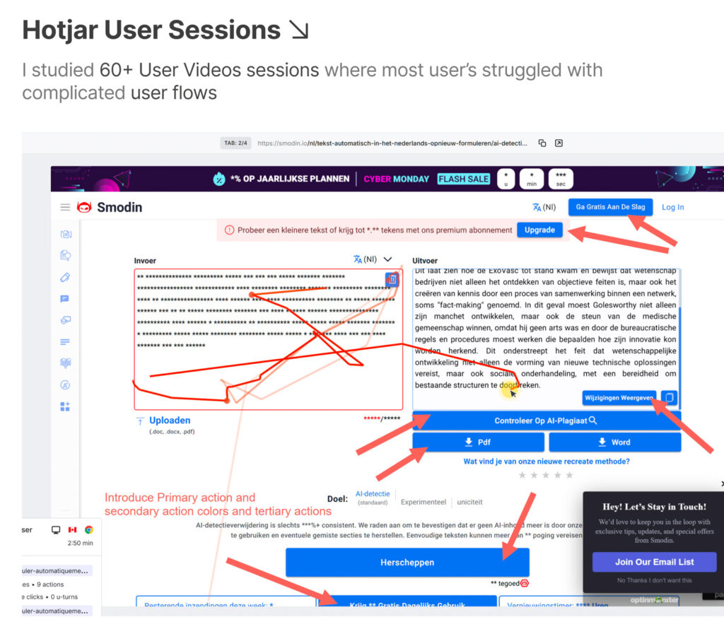
Smodin, an AI writing platform, came to us with a powerful product that felt overwhelming. Our UX audit found 37 usability issues.
The biggest one? Users had to jump across multiple modules just to finish one simple writing task.
So we redesigned the flow, and users could finish the task in one place instead of three modules. We also separated controls for students and teachers. Finally, we moved the key AI tools above the fold on mobile, with larger tap targets.
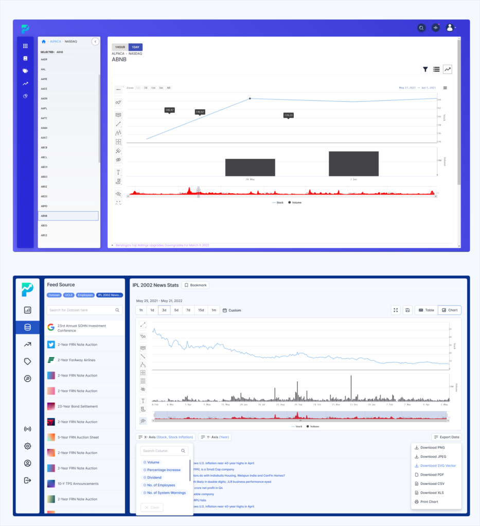
Plotter, a data analysis SaaS, had a different kind of clunky. The main issue was information architecture, along with poor buttons and labels. Users had to dig through five levels of data-source depth with no easy way back.
As a result, we recommended a five-level breadcrumb, cleaned up the labels and built a Figma design system, so every new screen stays consistent.
You don’t need a designer to spot the obvious problems. Instead, grab a coffee, open your product and ask yourself:
If you answered “no” to two or more, your SaaS UI design is probably costing you activations. For a deeper diagnosis, read How Do I Know If My SaaS Product Has UX Problems? And if your pain is mostly charts and tables, our SaaS dashboard design principles will help.
Some fixes are quick. Others, like messy navigation or a dashboard that grew for five years, need a fresh pair of eyes.
Timing matters, too. According to the UXPA, fixing a problem during development costs about 10 times more than fixing it in design, and up to 100 times more after release. Meanwhile, McKinsey found that top design performers grew revenue 32 percentage points faster than their industry peers over five years.
At ProDesign, we usually start with a UX audit to find the real friction points. Then our UI/UX design team fixes the screens that matter most, as part of our UX design for SaaS service.
Not sure where UI ends and UX begins? Our guide to UI vs UX for SaaS breaks it down.
Here’s a quick recap:
Every extra click is one more small reason to cancel. Let’s find yours before your users do.
👉 Get a UX Audit for your SaaS product OR book a FREE 15-minute discovery call with our team.
We focus on fewer projects to craft amazing digital products