
How Do I Design a Complex SaaS Dashboard That Is Easy to Use?
To design a complex SaaS dashboard that is easy to use, organize it around user roles and tasks, layer information from overview to detail, and reveal complexity only when the user asks for it. Group related data, give people strong...

What Makes a Good SaaS Dashboard Design? 7 Principles That Hold Up
A good SaaS dashboard design shows each user the information and actions they need most, in order of importance, so they can understand where things stand and decide what to do next within seconds. It is built around the user’s...
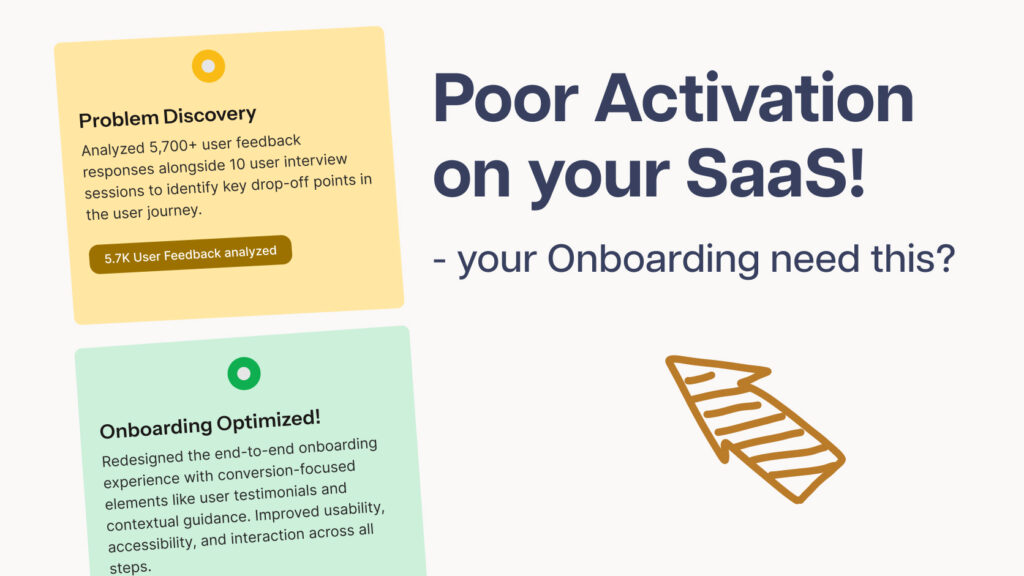
Onboarding UX: 7 Fixes for Poor SaaS Activation Rates
So you built your SaaS MVP, gave it away free to your first 1,000 users… and then watched most of them sign up and disappear. These 7 onboarding UX fixes will help you keep more of them, and an expert...

LumiMeds SaaS Onboarding UX: HealthCare Onboarding Redesign With Proven Results
Client Needs & Business Goals LumiMeds, a healthcare-focused SaaS platform specializing in weight-loss programs, needed a complete redesign of its onboarding experience in order to improve user activation, engagement, and retention. The goal, therefore, was to create a friction-less SaaS...

Knutsford SaaS UX UI Dashboard for Travel & Courier, With Proven Results
Project at a glance Client: Knutsford Express, a luxury ground transport provider in Jamaica Services: SaaS dashboard UX/UI design in Figma, clickable prototype, Bootstrap front-end development Budget: $2,000 to $3,000 Dashboard sections: Upcoming trips, new booking, email ticket, travel history,...