Client Needs & Business Goals
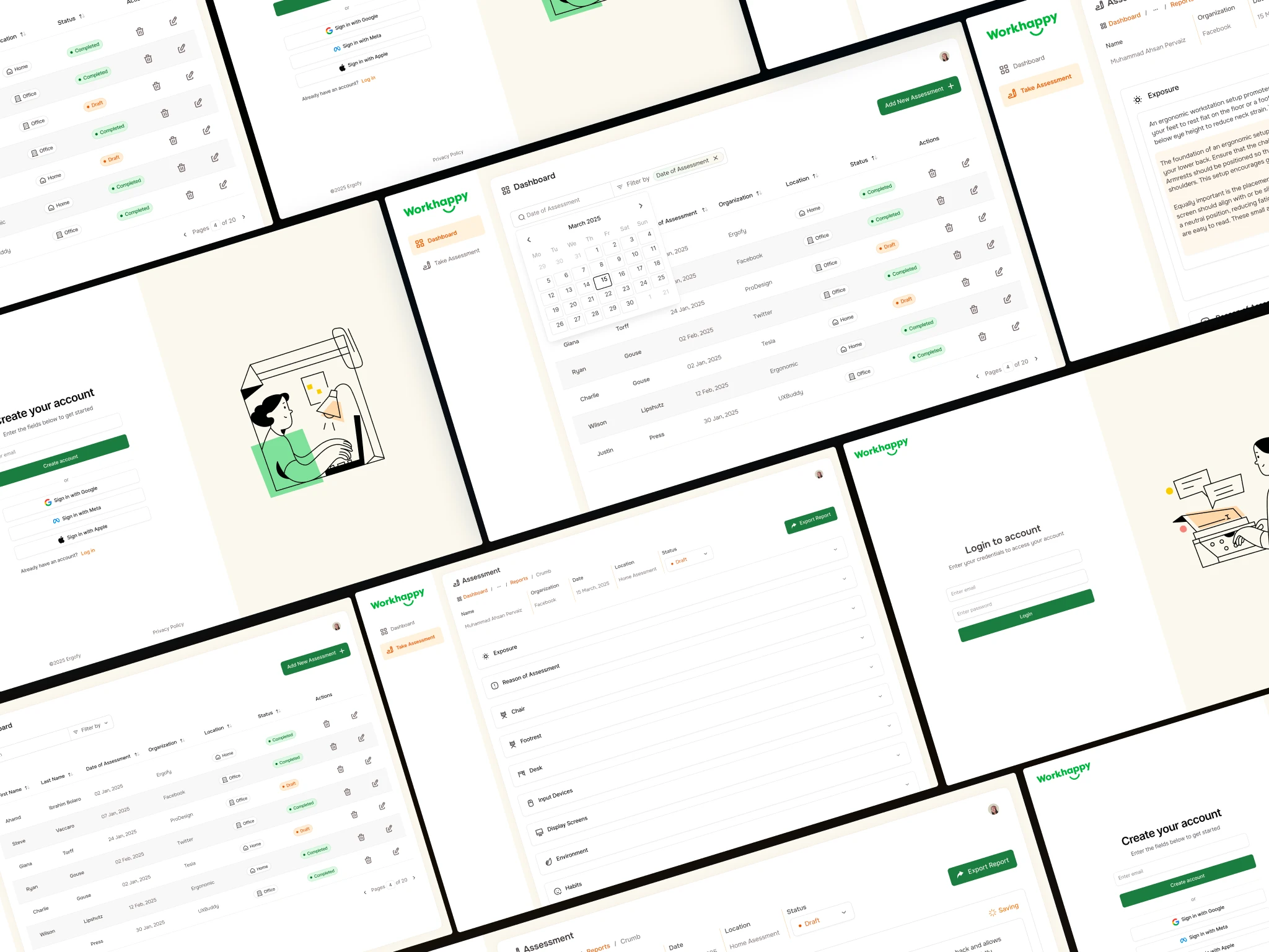
Workhappy is a B2B SaaS platform designed to improve workplace ergonomics by helping organizations understand employee needs through an intuitive survey system. The goal was to create an intuitive SaaS UX UI Design for survey web app that not only collects ergonomic data but also translates it into AI-powered charts and insights that surveyor can use for better decision-making and ease on their hand-held tablet devices.
Client’s Website ► https://www.workhappy.uk/
The Challenges
- Design a dashboard experience where users can easily take notes, arrange, use AI to help write.
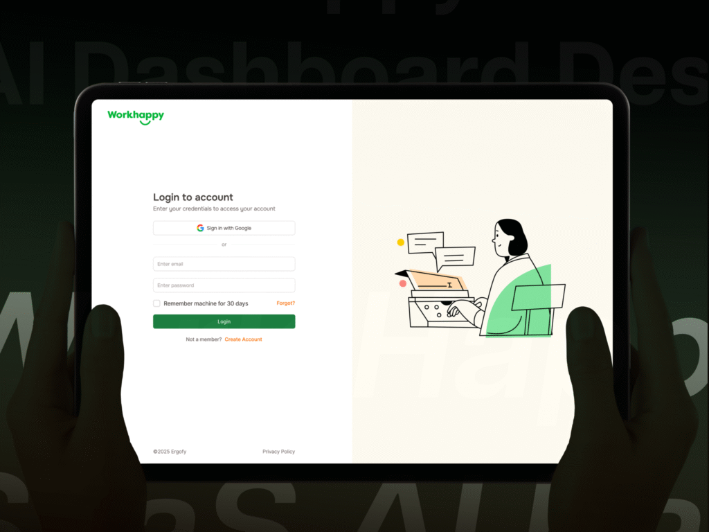
- Provide an option for users to take ergonomic surveys with their tablet devices.
- Ensure a seamless switch between View and Edit Modes with clear visual indicators.
- Improve information hierarchy and mental models so users instantly understand different sections.
- Maintain a clean, simple User Flow to start any survey displaying all the Business information at top.
About the Client
Workhappy Survey App
Budget
$2500-$3000
The Details of our SaaS UX UI Design solution
We designed the Workhappy Survey web app with a strong focus on usability and efficiency:
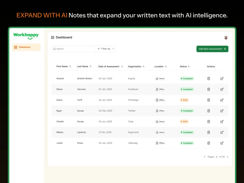
- Built a dashboard design where user can add assessment (Surveys), delete and edit them with simple interactions.
- Search and filter by dates and Organization names, editable states, and intuitive icons to match user expectations.
- Designed clear Status with proper color scheme to quickly see COMPLETED and DRAFT surveys.
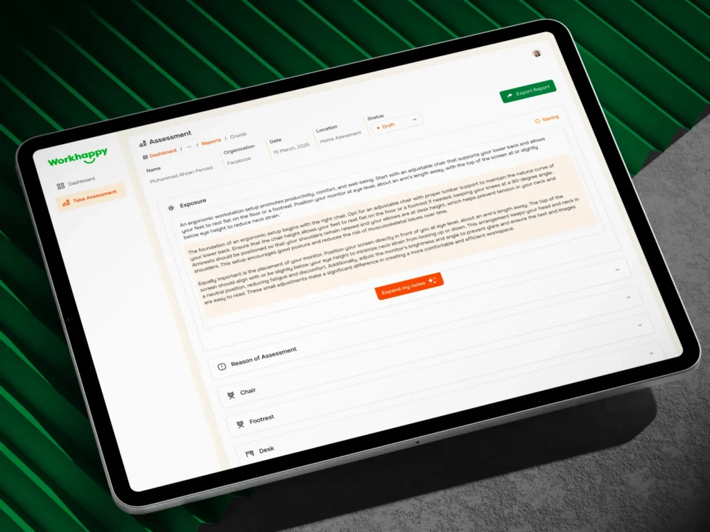
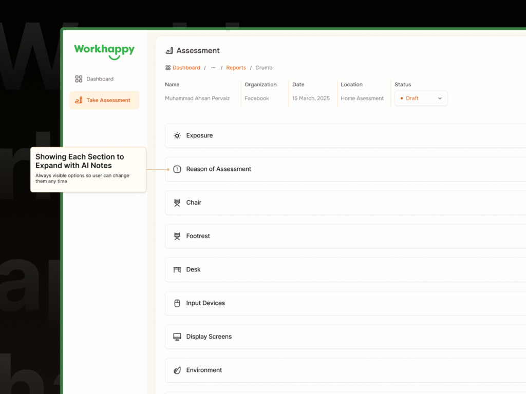
- We didn’t just designed the User Experience and UI, we also suggested multiple layouts for AI expand notes buttons inside the UI.
Prototype for SaaS UX UI App
Prototypes plays a crucial role in making SaaS applications feel more interactive, engaging, and user-friendly. Beyond aesthetics and prototypes guide users, reinforce mental models, and create smoother transitions between different actions.
Guide User Flow:
- Hover states, button presses, and loading animations provide instant feedback, ensuring the interface feels responsive.
- Animations highlight changes such as switching from View to Edit Mode or expanding dashboard groups.
- Subtle transitions make it easier for users to understand what has changed on the screen.
The End Result
The final design delivered a minimal and intuitive SaaS web app UX UI design where users can easily analyze ergonomic data through grouped AI Notes, while enjoying a seamless editing experience tailored to workplace insights and it was easier to use for a Surveyor using an iPad in their hands.
Client Feedback

Richard Charles (UK) – WorkHappy CEO
We just provided a simple notion document with specification to Lead UX Designer Muhammad Ahsan Pervaiz and he took everything from there. Crafted modern, minimal UI Designs for our WorkHappy Survey App with AI notes features. Not just the design but the prototype was a great gift to our development team to understand how the user flow would actually work. I highly recommend ProDesign team for any SaaS UX UI design or consultation.