

Humans are wired by nature to act like humans and behave like them. Similarly when a new user onboard and try to use your product for the first time. Its just like a first conversation with your product. Onboarding UX and flow will be the starting point just like before traveling your interact with your vehicle. Your SaaS Product is a vehicle for your users.
Poor user onboarding will severally effect your potential customer and their conversion to a paid customer. If you want to increase user engagement rates along with user retention, help your first-time-users with great onboarding flow.
Research showed that up-to 86 percent of consumers will pay more for a better customer experience
User onboarding experience depends on many factors, few of them I am going to list here so let’s go through them one by one
Our human brain is limited with number of choices presented to it. Similarly a very long process or very gigantic signup form can drastically increase the cognitive load and hence poor user experience.
Let the users reach her goals easily and quickly

Contextual onboarding means asking the users information or perform the tasks that are needed for that specific screen or user goal. Guide user with minimal effort from them. UI design also contributes as it must not be cluttered. Just keep in mind
There are many onboarding patterns and standards that are already working. Don’t try to invent a new wheel. Study your competitor or other similar SaaS Products and try to improve what they have. Look at how Samsung Watch on boards users.
One flow/goal at at a time (Effective onboarding tip)
Onboarding flow is your plan of moving your first-time-users from one stage to another within your SaaS Product. Do we really need to ask the user’s personal details before she tries out our product? Don’t ask for phone numbers in a signup form.
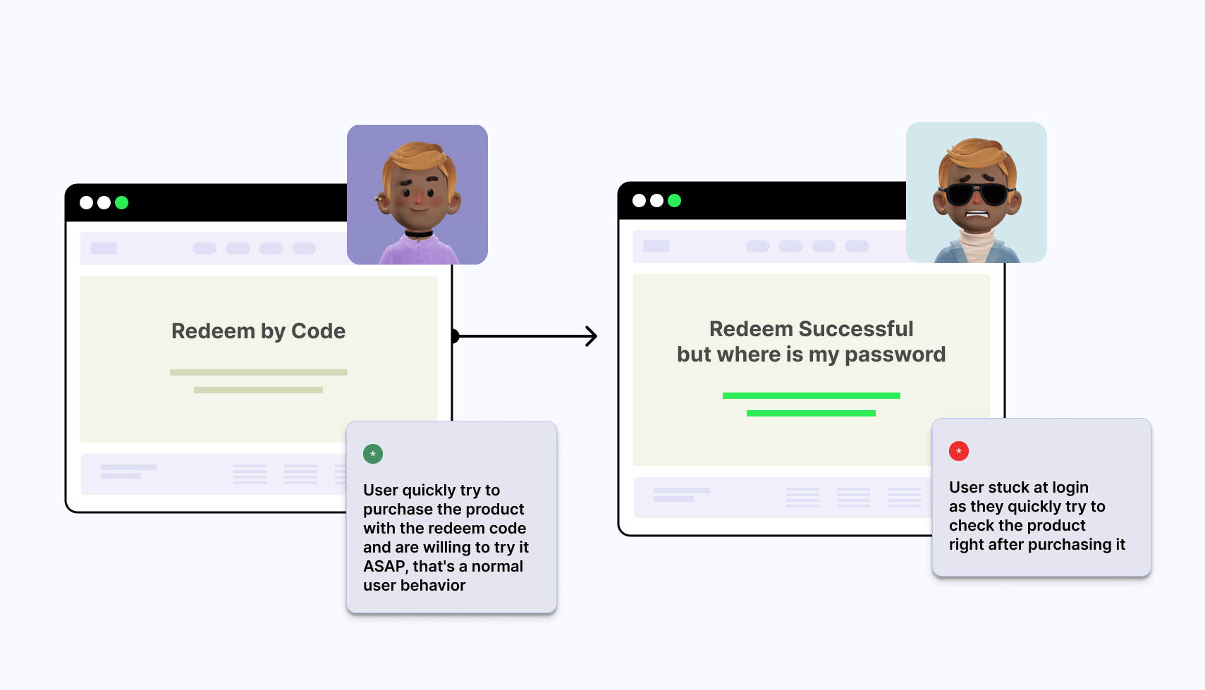
I was stuck in a user activation flow as Password was emailed to me which was not I was expecting.
Keep your onboarding user activation flows very simple. Let user set the password for her account
Don’t think of onboarding flow as a separate starting unit or module of your SaaS Product. Onboarding is your user’s journey from first-time-user to experienced or expert user of your SaaS App. You need to bridge that gap by using integrated onboarding/help and contextual onboarding patterns.
Do user really need to setup Credit Cards before using your product?
Ask user about information when only needed, not before that
Guide users when they need help, its just like a help guy following a customer in a store everywhere we go. Furthermore, Its annoying for the first time users
Users will skip video’s and user onboarding guides for the same reason
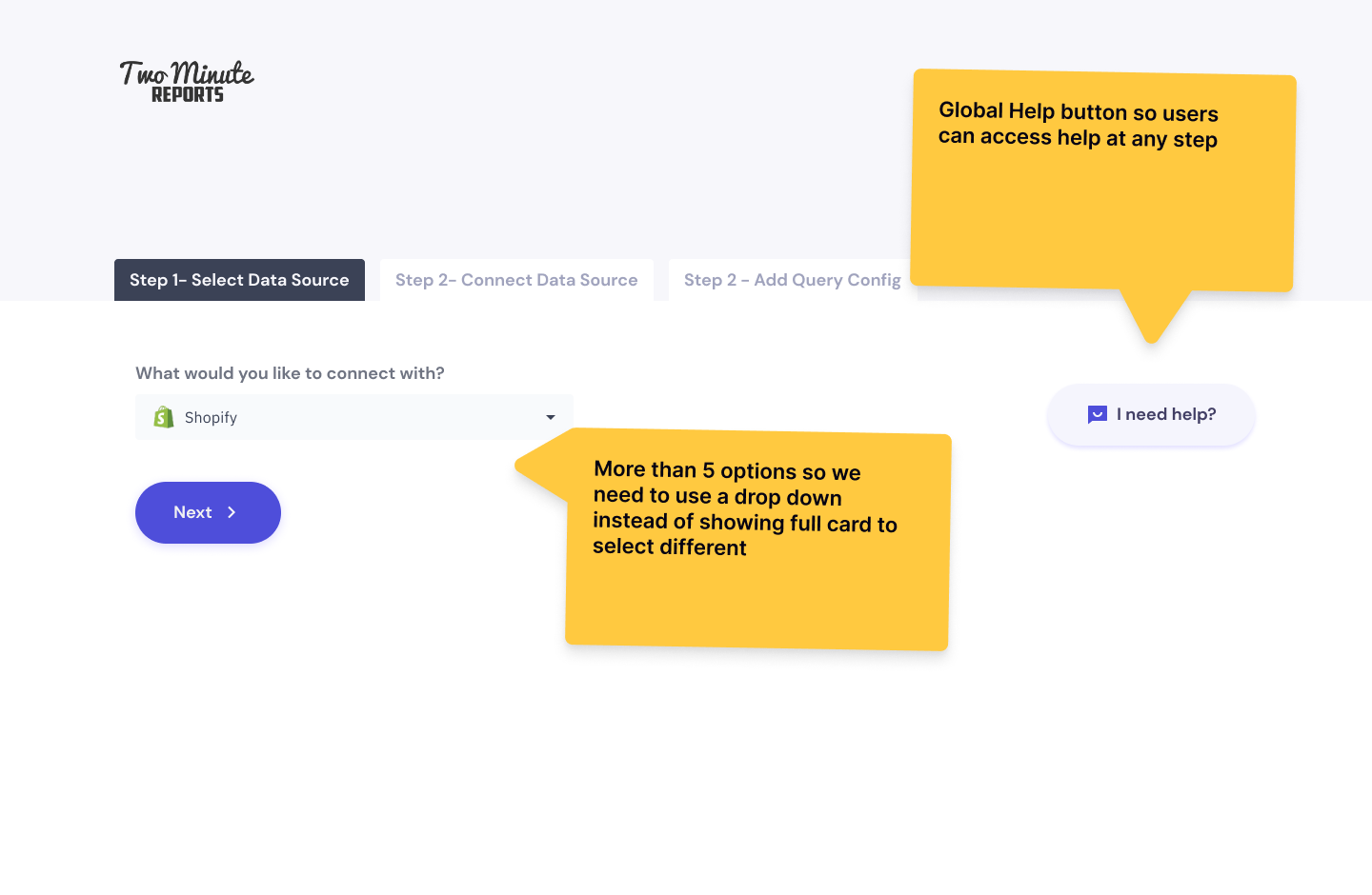
I have found that SaaS Products are copying other products UI patterns and making mistakes during their new user’s journey. Each product user persona is different so their needs, goals and behaviors might be different.
User journey starts with a Welcome message. It must do at least two things successfully.
You can also send a reminder email, if the user don’t use your product after the welcome email.
Product tours are becoming more like a trend these days in most of SaaS products I have tested. But users want to interact with your product first, they don’t want to read long product usage manuals or videos.
Front-loaded instructions in the form of Video or a Product Tour will mostly be skipped by most users
User research shows that overwhelming users with too much information will make them think that the product is difficult to use
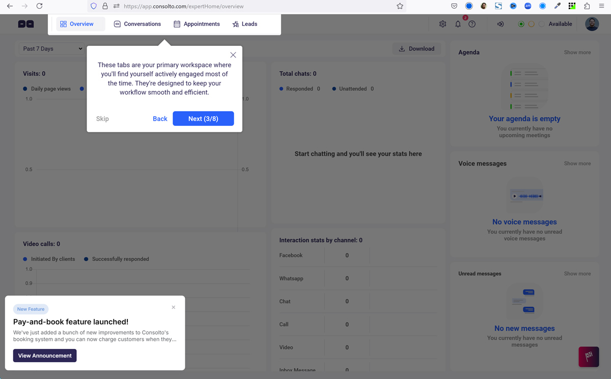
First time user experience can be ruined by overwhelming user with too many product tours just like Consolto App does.
Instead, it must be triggered by users. If a user needs some guidance they can click on any area of the Product or a question mark and can learn about it.
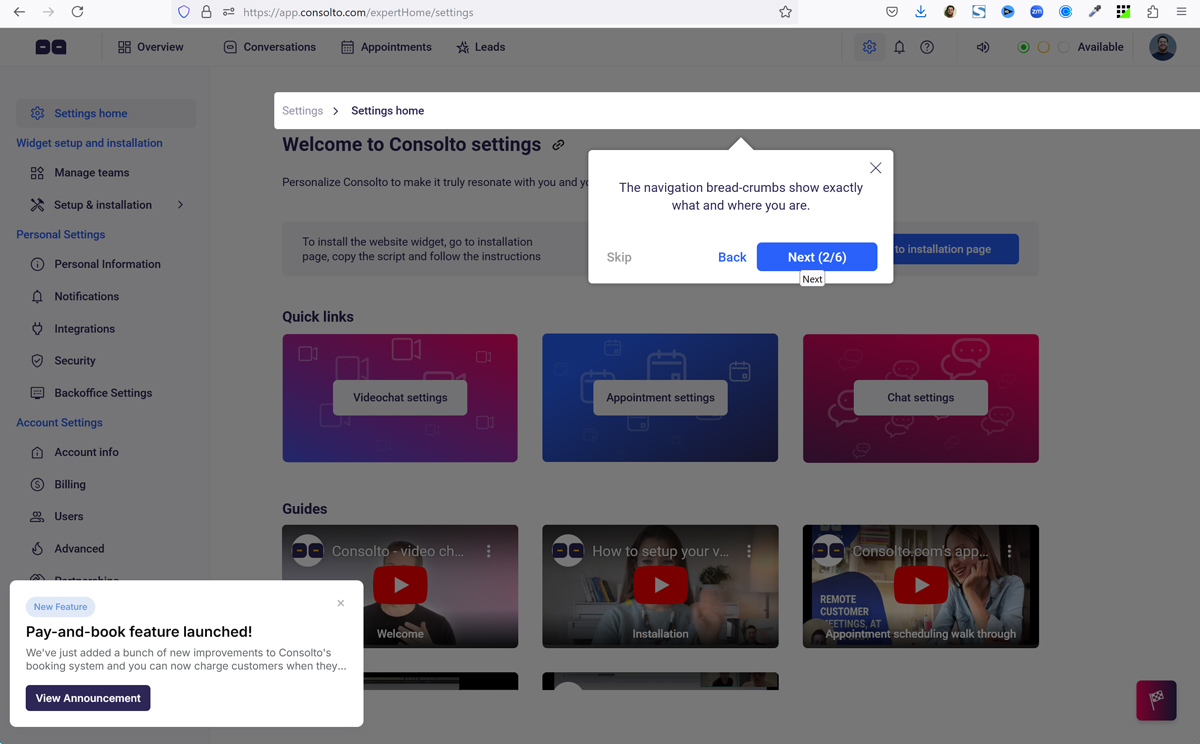
Similarly different user personas might need different product tours, and what about the product updates. What if you change your user onboarding process in the version 2.0 of your product.
How many times will you update and change the video or product tour guides (front loading Instructions)?
Alerts are great for User Feedback but showing too many pop-ups like signup now just after onboarding might deter users and can hinder in the path to improve your onboarding flow. Use alters, pop-ups and signups only when really needed. User doesn’t need to commit when they have just met your product.
Essential alerts like “Verify your Email Address, check email now” are great but they must work flawlessly and let your users interact with your product.
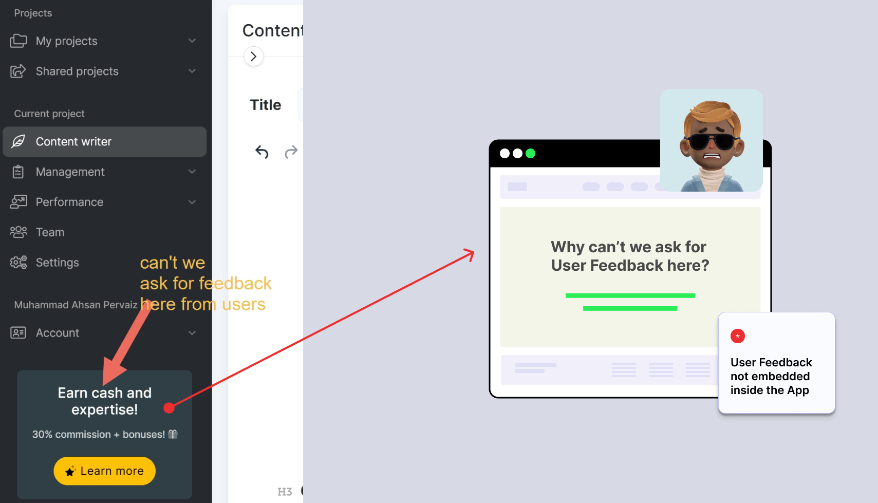
Show user a feedback form pop-up when they encounter some error or unable to use your product.
I am seeing a lot of Signup form Usability issues with SaaS Startups. Please pilot test your user Onboarding flow with 5 to 10 users before launching your product in the market. I was stuck on the First name form input field twice in the past 3 months so make sure
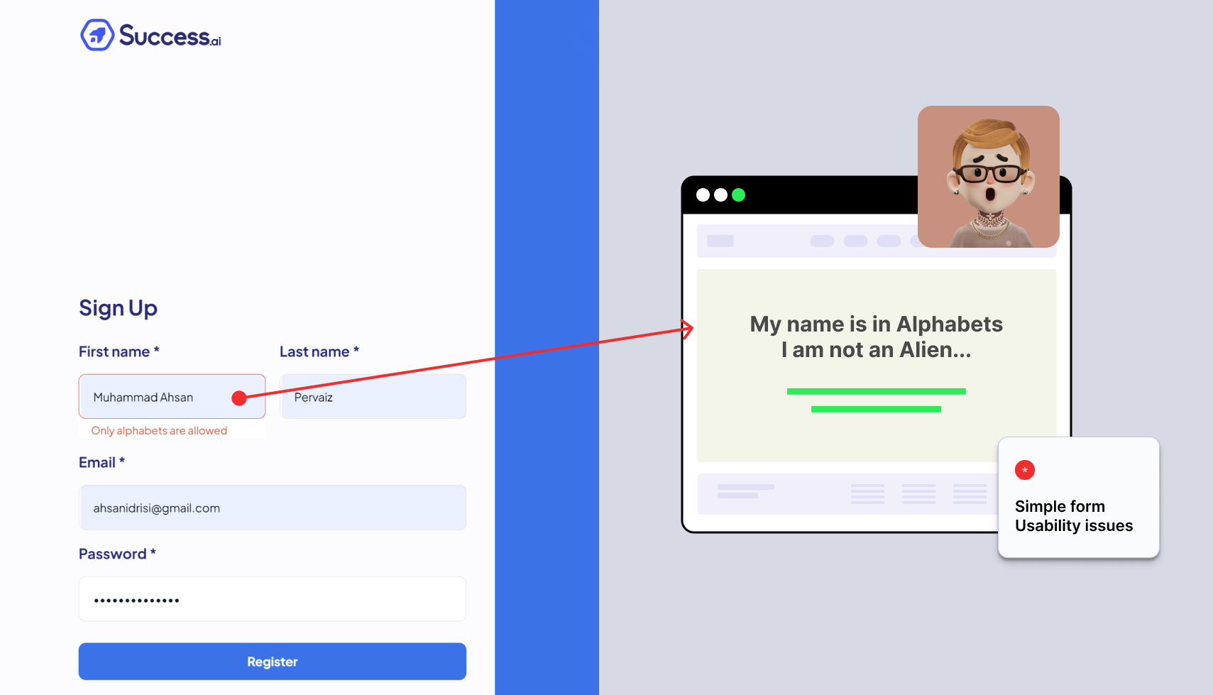
Your Onboarding checklist must include testing the usability and accessibility of all the forms in your SaaS Product
If you meet a person for the first time and after asking her name, you ask about 20 different details about her. She might get frustrated so your user might feel the while user completes signup form.
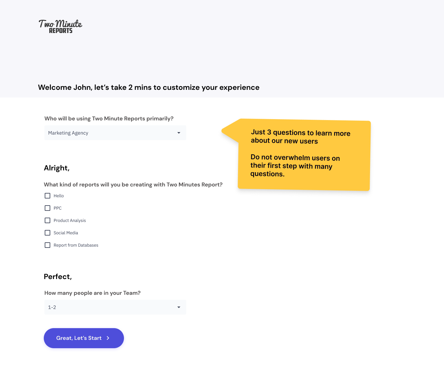
Ask fewer question, I would say keep them 5 or less questions like
Who told you about our Product?
Have you ever used note taking tools before?
What is your industry/job etc…?
Any suggestion you have for the product?
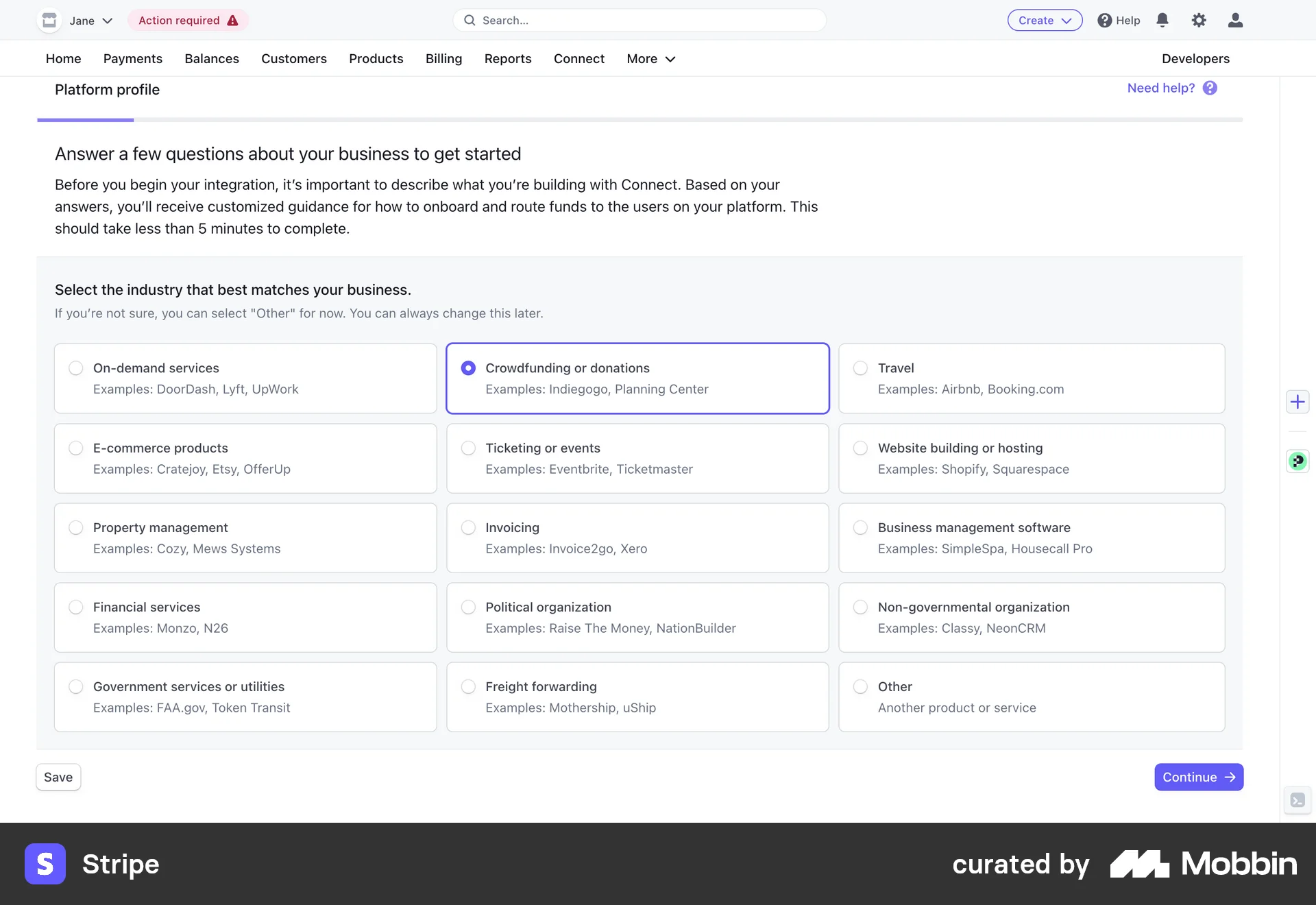
Asking question for personalized user onboarding is great but too many questions doesn’t improve the user onboarding in any way.
Best onboarding is not just a single flow but a continuous support and help for your current and potential customers.
If your users are calling support about some feature a lot, then you need to write it down as it might be the next step to improve your onboarding approach.
Which features you want to build next?
Why user’s are leaving our SaaS Product?
What should we build next for our users?
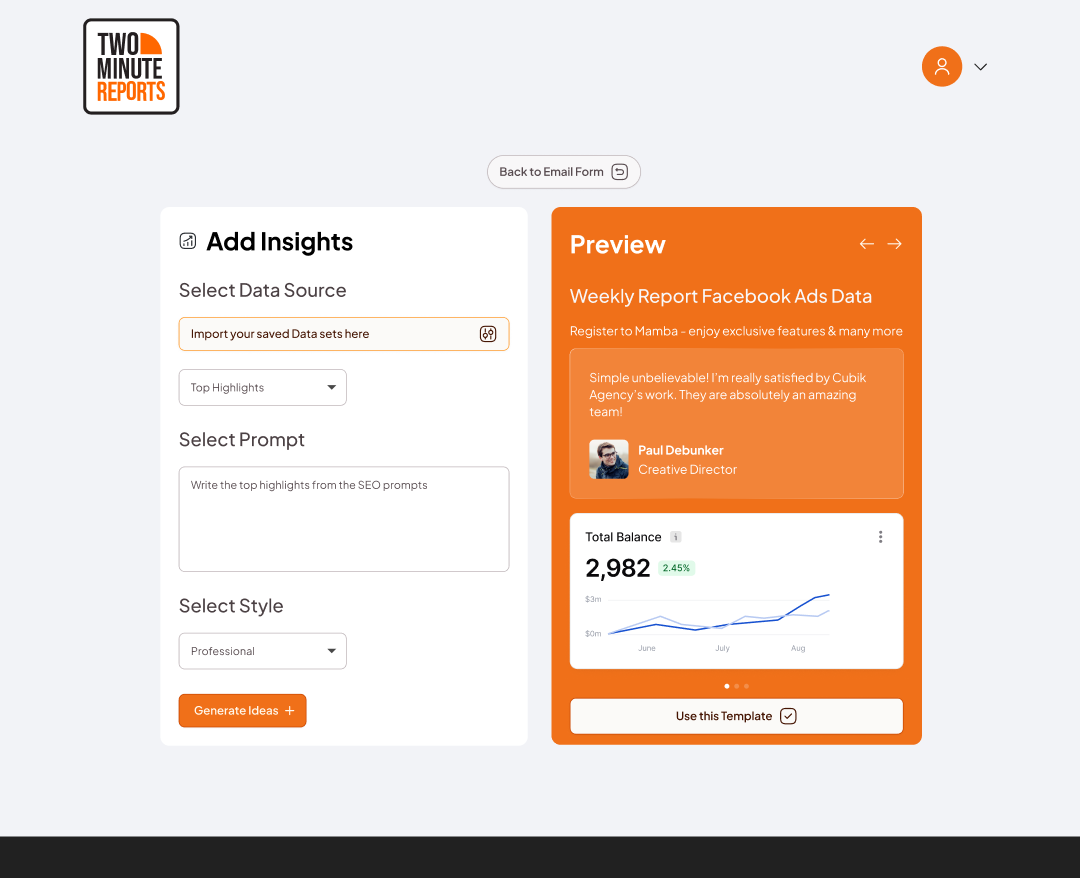
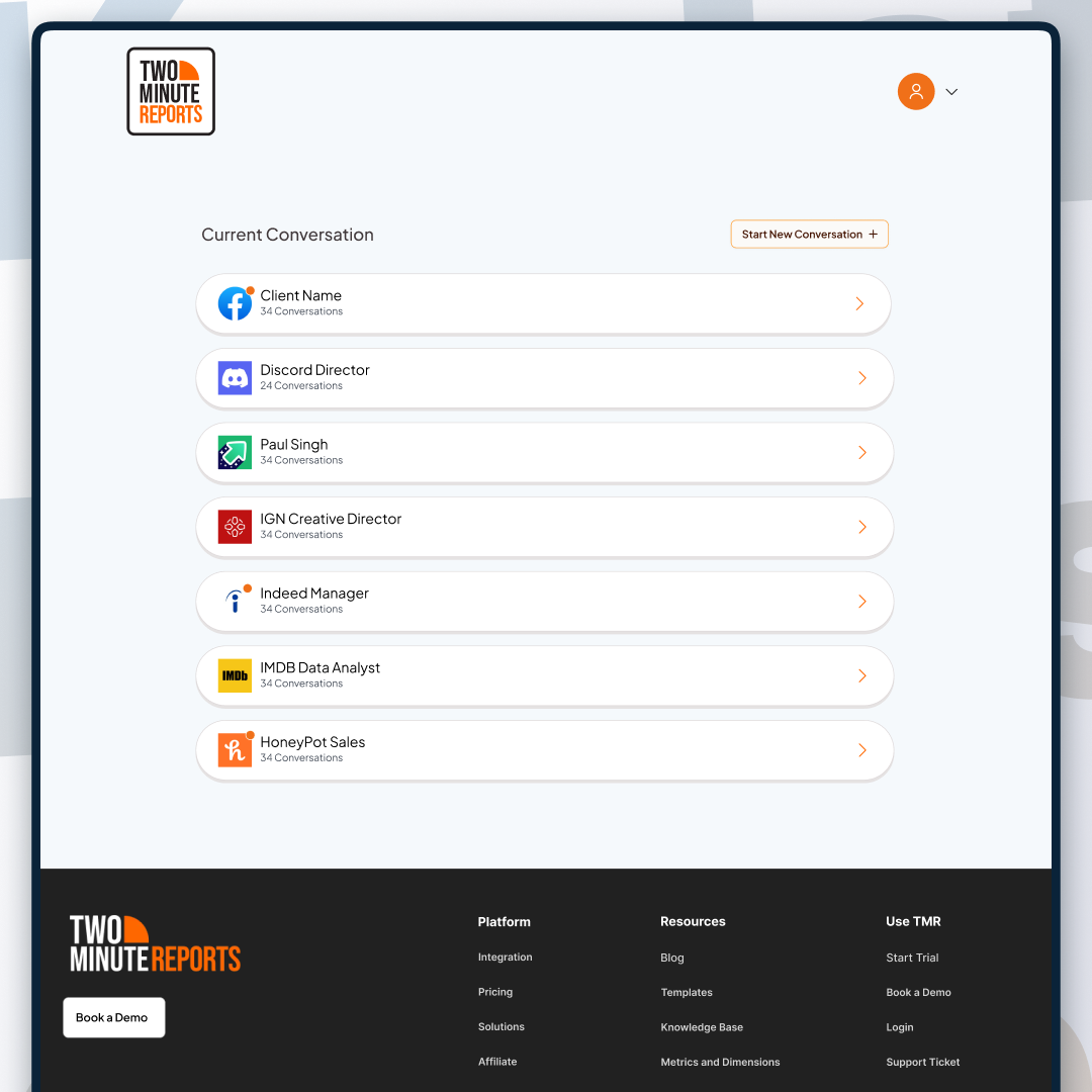
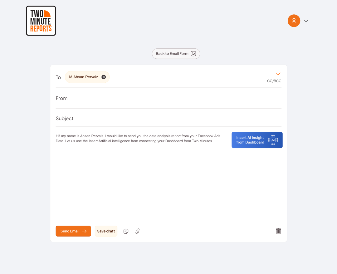
I am working on the SaaS UX Design of a reporting tool called “Two Minutes Report” and they found out that the needs of their users via product support which was “Most of our users want to send the Insight report our product generates to their clients” so they are building an email conversational engine inside their reporting tool so their user can do both tasks inside the same product.
Onboarding ux is the in-app experience for your first-time user. It can guide users to product features they have never used. It can leave a lasting impression on your users and can make them life-time users of your SaaS Product.
I have been designing Onboarding UX and SaaS Products from past 20+ years and performed UX Audit for numerous SaaS Startups. Well-designed onboarding ensures great user experience from the start and increase user retention rates many folds. User Interface provides the help users need to use the product and complete onboarding tasks effectively.

Hey there 👋 I’m Muhammad Ahsan Pervaiz, your go-to Product designer for SaaS Startups.You can find me on Instagram, and Behance or reach out directly by booking a call for freelance projects!
Checkout our latest SaaS UX Design project for AI Startup called SkilledScore in the case studies here.
We focus on fewer projects to craft amazing digital products