
Muhammad Ahsan
August 12, 2024

With Gen Z and advancing technology, thousands of SaaS startups are launched on a daily basis. Being a competitive industry, if you need to stand out from the crowd, you need to have an A+ User experience and better usability than other SaaS products in your industry.
90% of the Startup Founders think that usability testing and conducting a UX Audit is waste of time. But having a detailed UX Audit report can fix 50% of your Usability and UX problems for your digital product. So before launching your startup in the market, just have a heuristic evaluation by a UX Consultant, it can help you eliminate obvious user pain points and identify usability issues that can easily be fixed.
Research showed that ROI for UX is you get $100 for spending one dollar on UX research
These are the actionable insights we got when we performed a ux audit for more than 25 SaaS products listed on ProductHunt and AppSumo.
Onboarding a new user is a crucial step in user journey but we found 3 to 5 startup signup forms where user got stuck on filling out his full name. This is a simple accessibility problem that can be fixed with just removing limit to the input field.
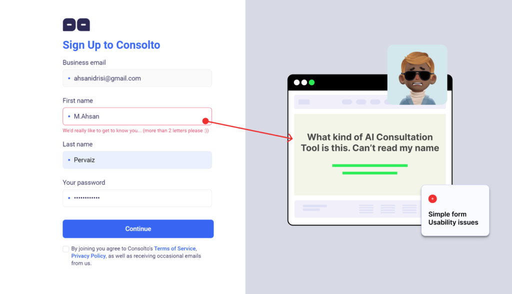
Just imagine a user first time trying to use your digital product and are not even able to sign up for a FREE account. Just feel the pain here.
Startups please fix your Signup Forms
-UX Consultants
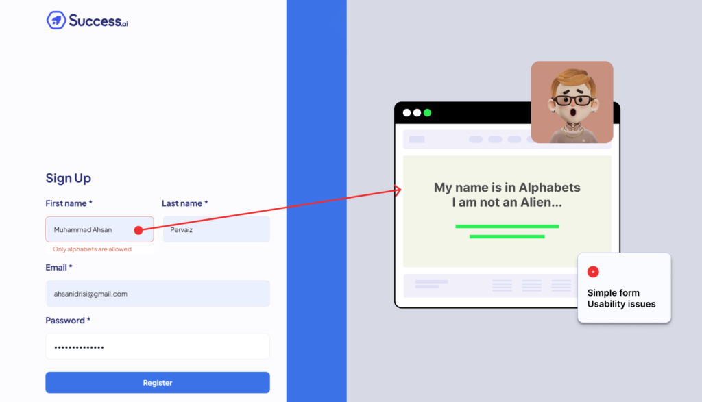
Second, there were no proper labels on the text input fields. Redesigning their onboarding flow and few accessibility improvements fixed most of these issues. Form UX is so crucial for your website or app, just conducing one UX review can reveal product’s ux issues.
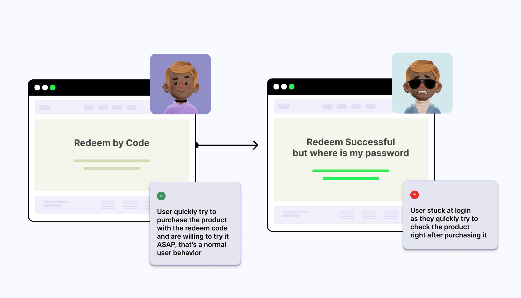
User flow and information architecture guides your user from one place to another, let them complete hectic tasks easily. Saas UX audit revealed confusing user flows like we were stuck on changing the password flow. Your Product team can easily fix these flows to reduce bounce rates.
If you want to improve user experience, just don’t deviate from user’s current mental model patterns (Design patterns already established)
NeuronWriter is an SEO tool to write blogs and articles and its critical function is to save and store whatever user has written. What if the user opens the article on his laptop just after saving it on his PC and then nightmare happened, whole blog article was gone, poof, finished.
Thorough UX design audit for NeuronWriter revealed that sometimes when logging into multiple devices with the same account, it doesn’t save the information or article written by the user. So it had problems with saving multiple sessions or merging multiple sessions on different devices.
For NeuronWriter critical problems could be:-
List all the Tasks and functions that are critical for your product to work the best for your target audience. Make sure all the user interface elements necessary to perform those tasks are available and there is no critical issue that affects your primary user’s workflow.
Using Free UI kits can pose ux issues when you don’t have UX Designers in your team. Free Design resources are limited in nature and might not fit every situation or industry. Conduct UX audit along with UI Audit to properly see the multiple button sizes or confusing labels and areas of improvement in your current User interface of your product.
Consolto App case study: Why Consolto App confused new users
Consolto is a live video consultation/chat app where you can talk with your customers from your website or mobile. A comprehensive solution for many businesses, mostly consultation businesses. Usability Audit resulted in one obvious problem with few digital products: “
“Overwhelming users with too many features and guides”
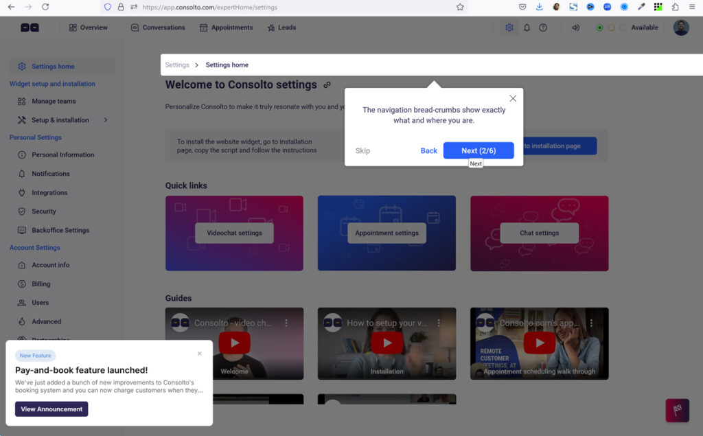
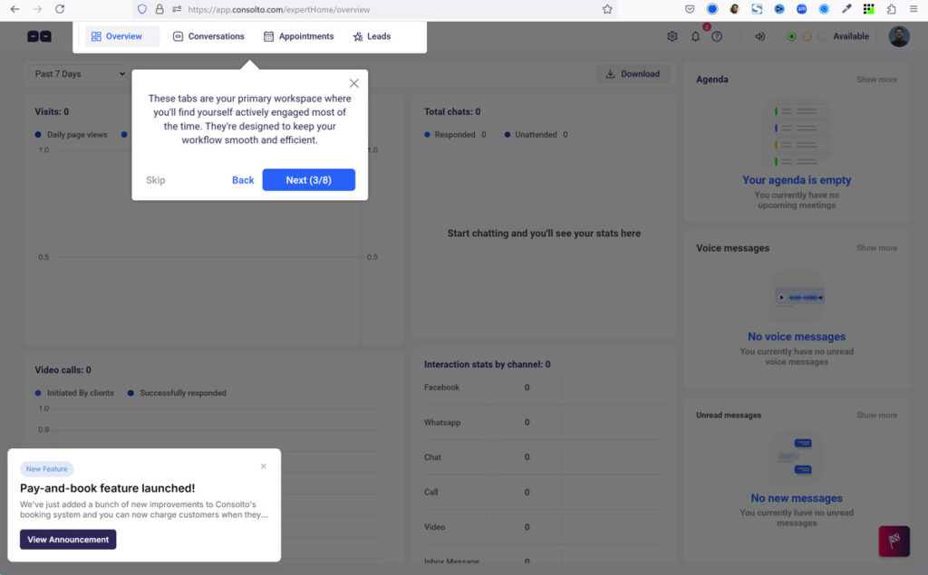
Business goals and user personas should be aligned with simple onboarding guides, do not overwhelm users with too many guides, they will skip it. If your interface needs a step-by-step guide on each screen, its not easy to use for your users.
Information architecture not just involve customer’s context but also the customer’s language and mental model. Having a confusing flow, link text, labels of your text fields and not having a proper strategy for information design are all signs that its time to conduct a user experience heuristic evaluation.
We already showed above that hiding icon labels or main side bar for users to take actions should never be hidden. Do Gmail hide their left side navigation bar text/labels.
To learn the user behavior, you need to ask few at least 3 to 5 questions when new user onboard. Its a kind of user survey that can reveal things like:-
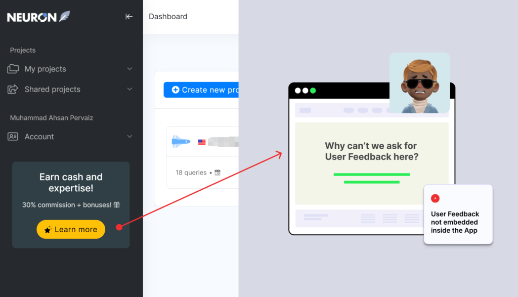
User satisfaction after they onboard and use your product first few times is essential just like user interviews. Tools like hotjar and Google analytics can reveal a lot about what your users are doing on your website or app. Hotjar can generate user heat maps, video record user sessions and also embed a feedback pop up form on your website.
We loved as when we left a premium account of a digital product, we received a polite, encouraging email and the best surprise was they gifted us their life-time usage so we can tell them in detail “Why are you leaving us?”
So here are few tips to implement here

Just conducting one ux audit can help you identify areas of improvement in your product that are hidden in the plain sight. We wanted to test out new SaaS startups and how much value they give to User Experience and Product Design. Your Onboarding UX Process along with Critical Tasks must both be in perfect condition before launching your product in the market.
We focus on fewer projects to craft amazing digital products